The Conversation
After viewing the client's brief and user research on my machine, it's time for a conversation with the human(s). This is my favorite way of building empathy with the client - the design consulting workshop. I asked them key questions about their design goals and aesthetic preferences.
According to the stakeholder survey, the Airport defines itself as:
Forward-Thinking + Family Oriented
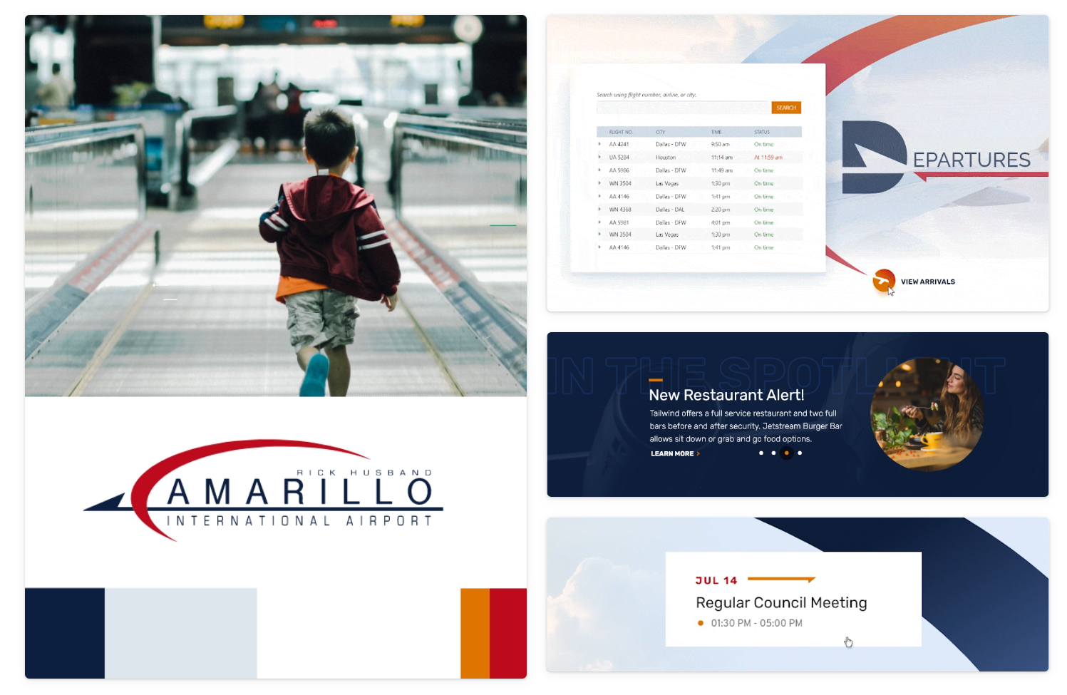
The Rick Husband Amarillo International Airport is a public-use airport serving the Texas Panhandle, western Oklahoma, southern Kansas, and eastern New Mexico. We strive to be a progressive airport and also provide an excellent and safe passenger experience.
I asked the team about their target audience — between visitors, residents, and businesses who would you prioritize for the redesign?
Really, we are trying to target all of these groups...
"If we have to prioritize them, we would prioritize, visitors/passengers as #1, residents as #2, and businesses as #3."
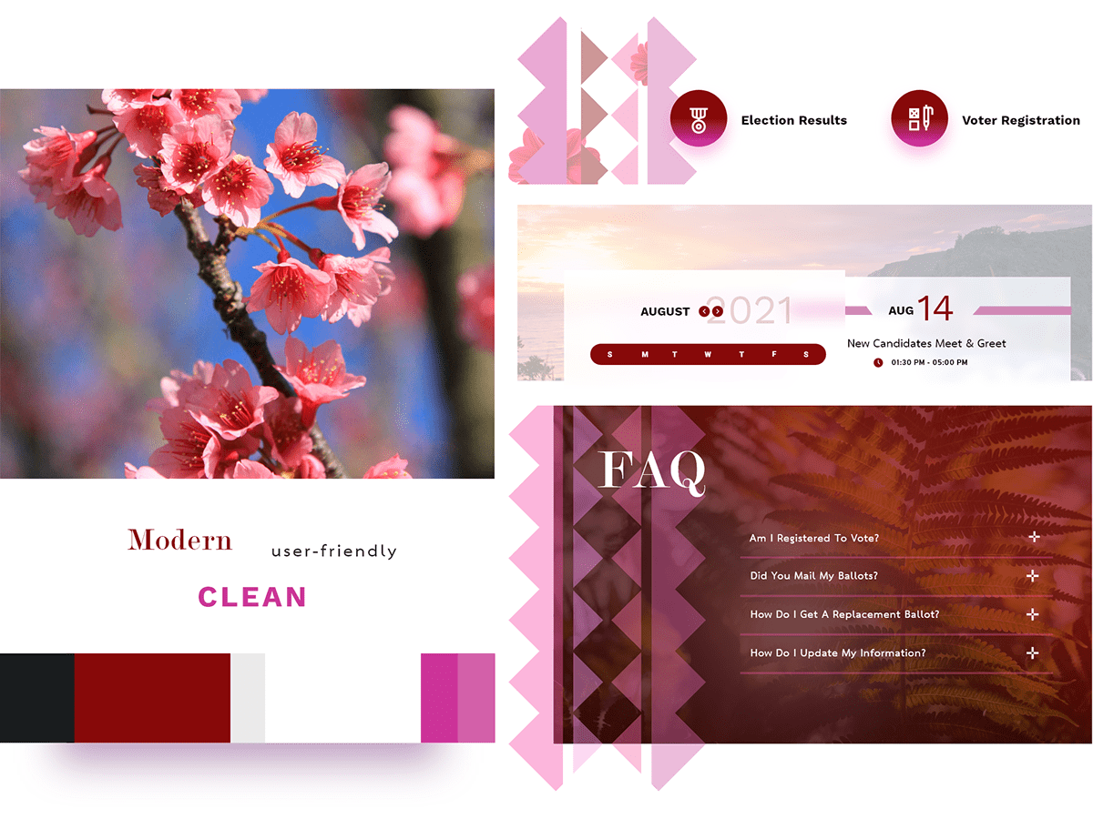
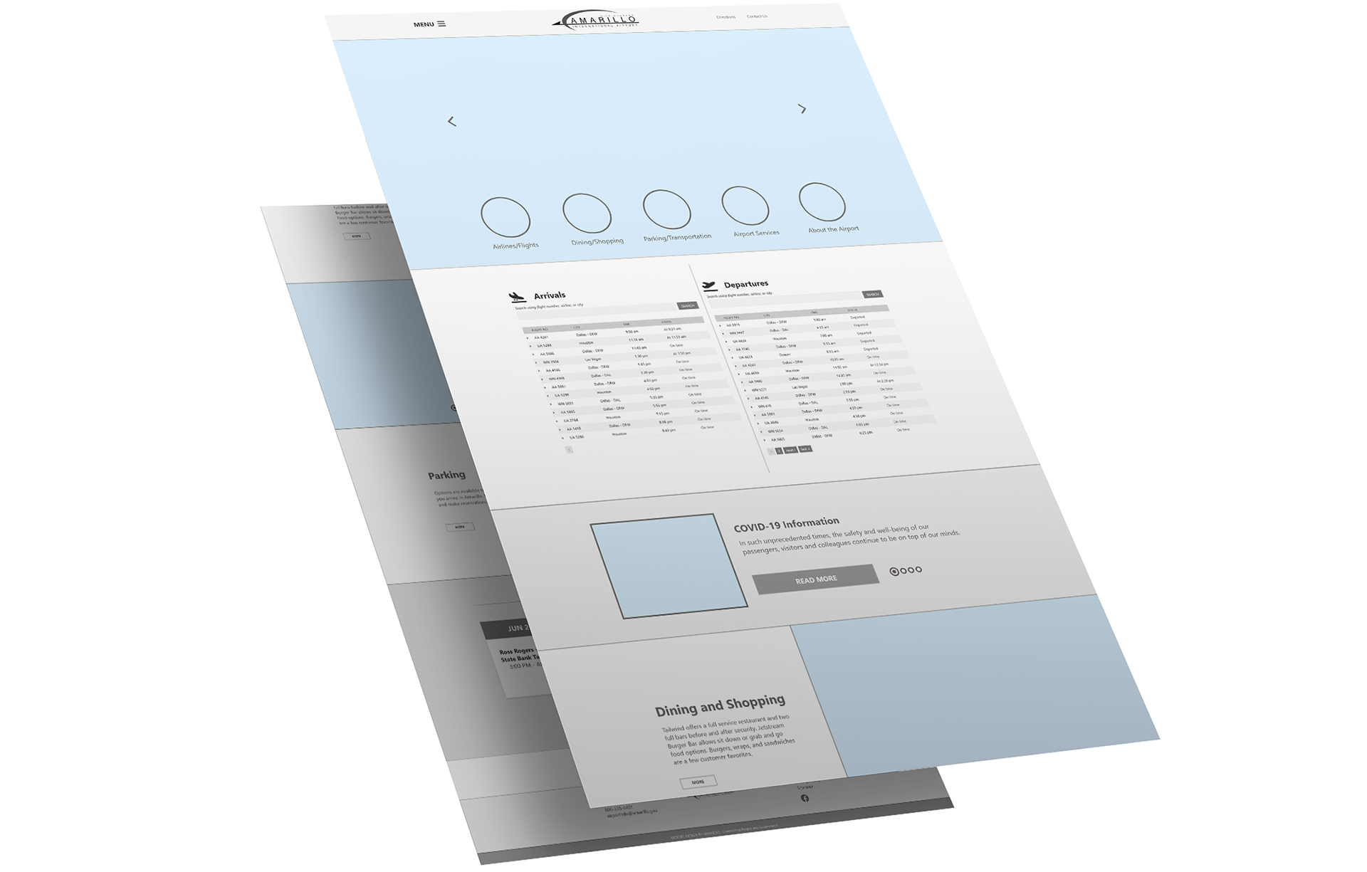
The Style Tiles
A crucial part of our conversation are the style tiles; think of style tiles as a cross between a mood board and a mockup. I designed these small bits prior to the meeting based on limited information. Feedback from these help to inform the initial design and minimize revisions.

Core Feedback
• The serif font is "cute." (this means use it)
• The red & fuchsia are too strong — aim for a muted color palette.
• They like the colors and feel of the muted imagery behind the calendar snippet.
Showing the style tiles triggered a lot of feedback, good and bad. Either way, I got loads of information that helped me to aim for the sweet spot in the full initial design. Style tiles reveal crucial feedback: hit or miss — it's still a win.
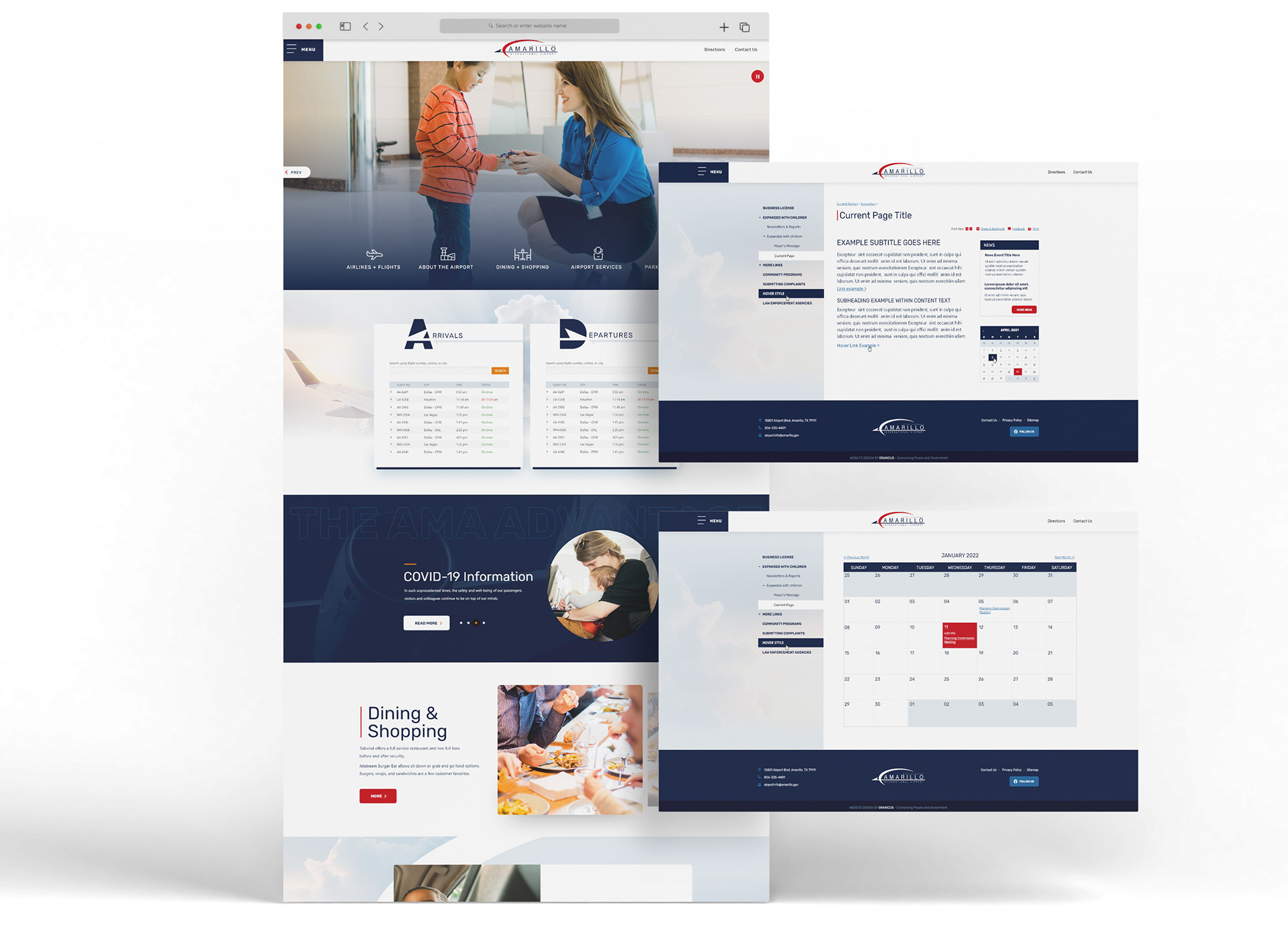
The Design
I have enough information to get to work on a full-fledged design. Now it's time for me to translate this wireframe, built by Grant Hasbrouck, into intelligent visual language.
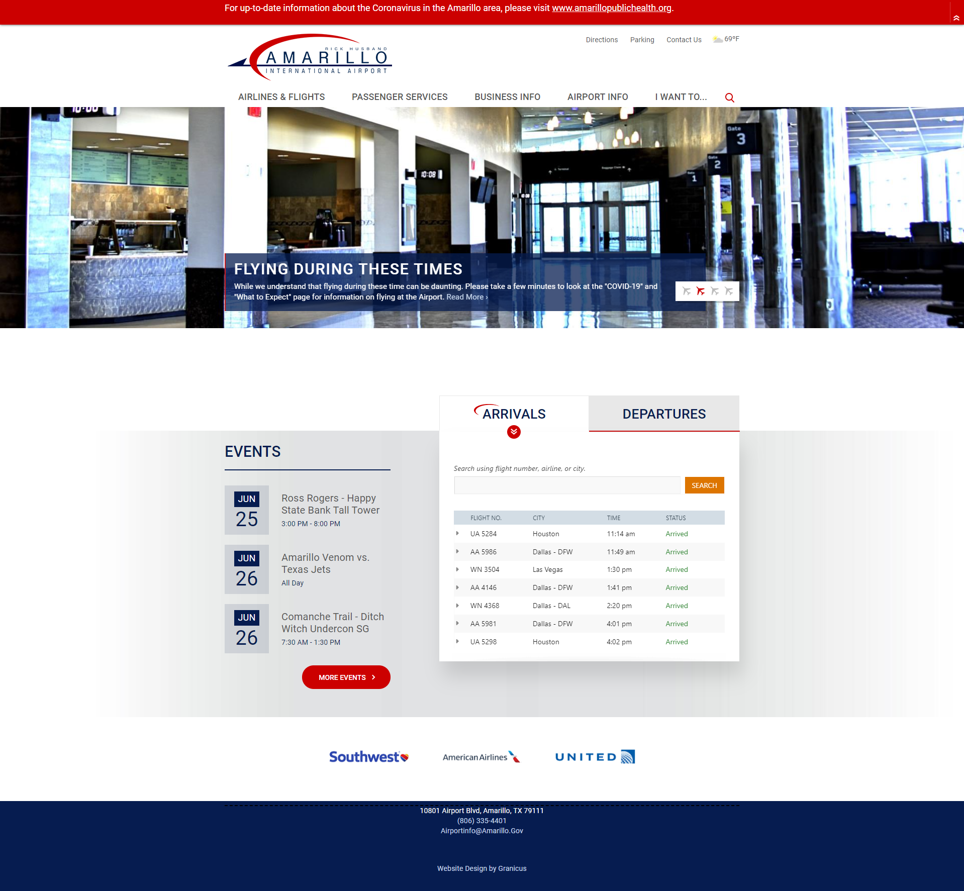
The Old
The New
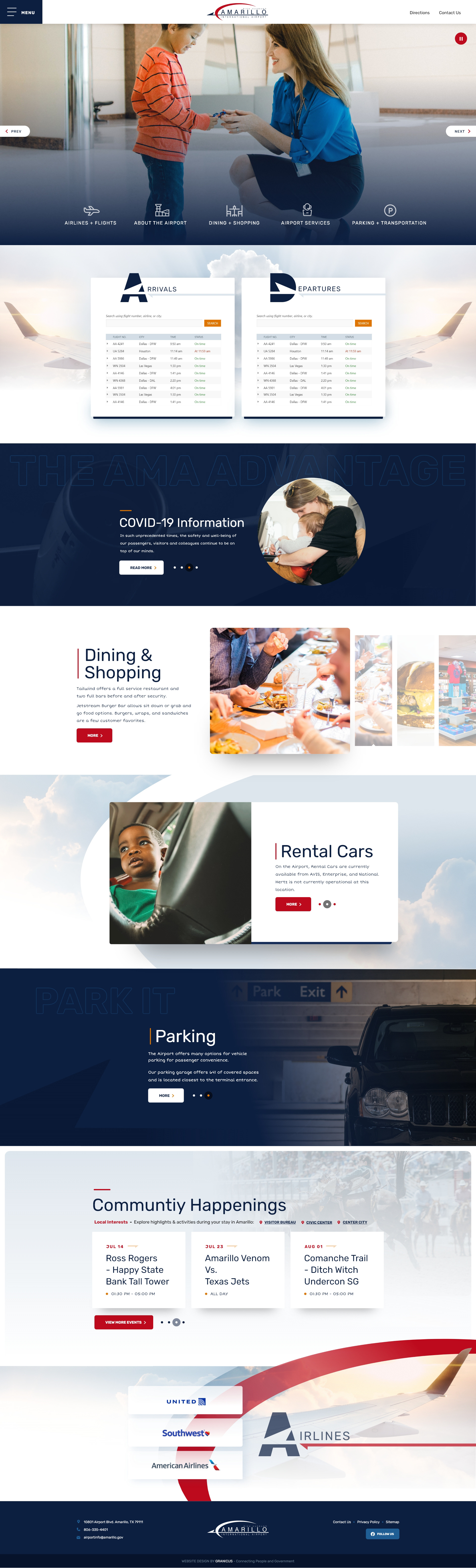
Overview
This is a design I created for the Rick Husband Amarillo International Airport. I took the sharp and rounded shapes of the logo and incorporated them throughout the landing design for a consistently branded web experience. The rounded buttons and imagery of people make the design feel more welcoming. I included clouds and drop shadows throughout the design as well to add dimension.
A Challenge
The flight schedule was a 3rd party API that I couldn't design freely. I designed around the APIs so the section could still have a modern look. The harpoons in the "A" and "D" are from their logo, I thought this was a cool way to incorporate their branding.
The Spotlight
This section is used for them to spotlight certain stories or pockets of information on their homepage. I presented this same aesthetic in the style tiles and they liked the "luxury" of it. Style tiles not only are a good feedback mechanism, but if they are done right and the client likes them, they can save you work in the initial design.
Dining & Shopping
This airport wanted to highlight its restaurants and stores, which is where this section comes in, and a reason the image has the most visual weight in this section. This is also the first section I began to really incorporate red. The orange from the flight schedule API is something I couldn't change so I sprinkled it throughout the rest of the design so it didn't seem unnatural. Red is their actual brand color. I don't mind the orange in the color palette though, it works well with the dark blue.
Rental Cars
The Rick Husband Amarillo Int'l Airport wanted to be portrayed as "family-oriented," which is why I placed the picture of a child here — in case you were wondering.
The swoosh in the background is curvature from their logo, once again reinforcing their brand.
The swoosh in the background is curvature from their logo, once again reinforcing their brand.
Parking
This webpage is mostly on the lighter side in terms of color usage. I used a darker section here as well so that the page doesn't get too washed out and stays interesting. It also gives me another opportunity to incorporate the orange.
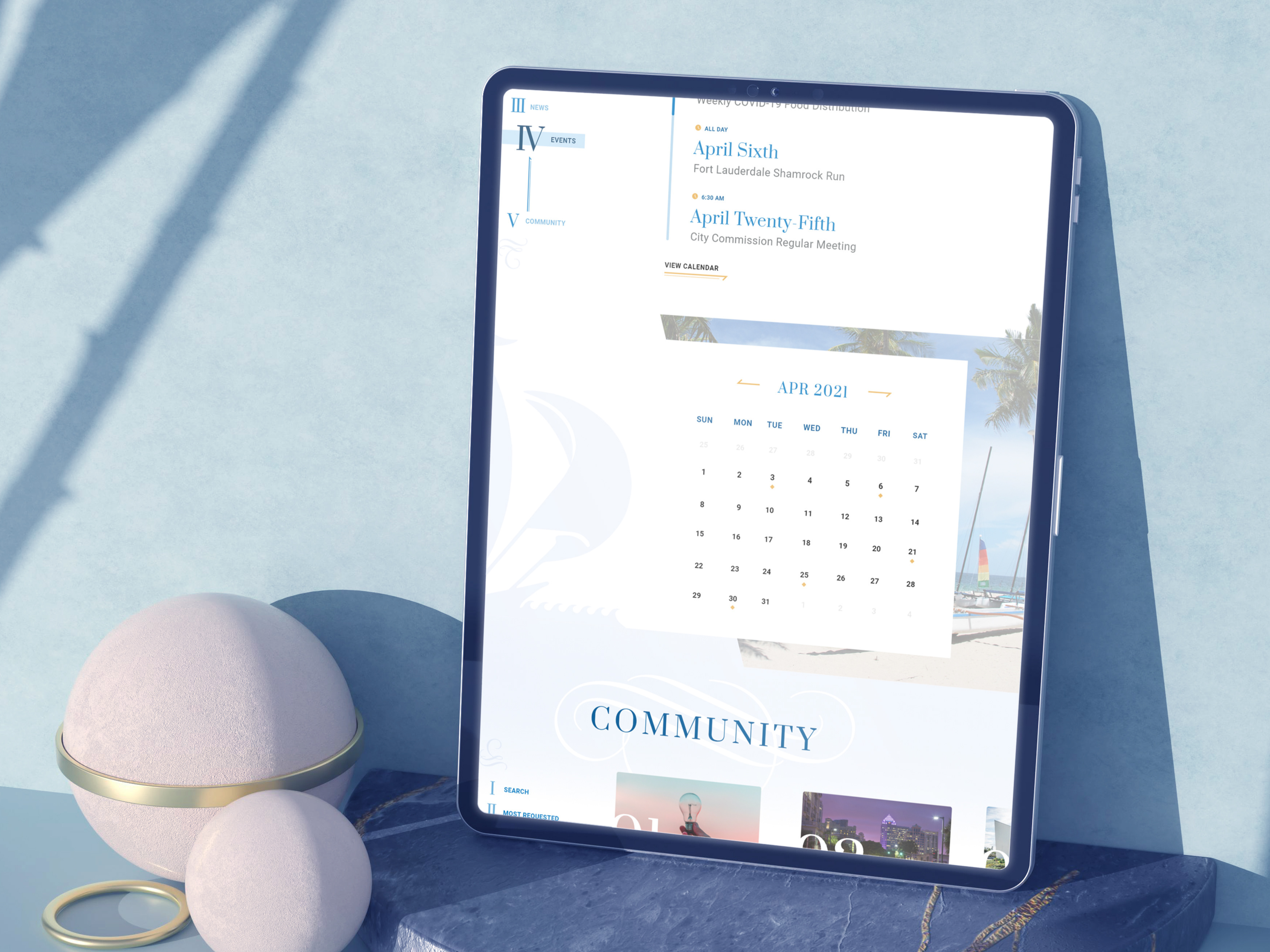
Community Happenings
This website is meant to target both visitors/passengers and residents. They wanted to incorporate things happening in their community within their airport website. This includes rodeos.
Airlines
In this section we have both the swoosh and harpoon from the logo in action. Do you see how the tip of the airplane wing is coming out of the picture and on top of the swoosh? As I mentioned in some of my other case studies, this is one of my favorite design techniques I use to add dimension into my designs. I call them dimension breaks, a trademark of my work. Even though it's subtle here, it just adds that little bit of extra that keeps things from looking stale.
Interior Pages