The Conversation
After viewing the client's brief and user research I prepared a presentation for the initial design consulting workshop. We spoke about their goals and aesthetic preferences. Here are some initial insights:
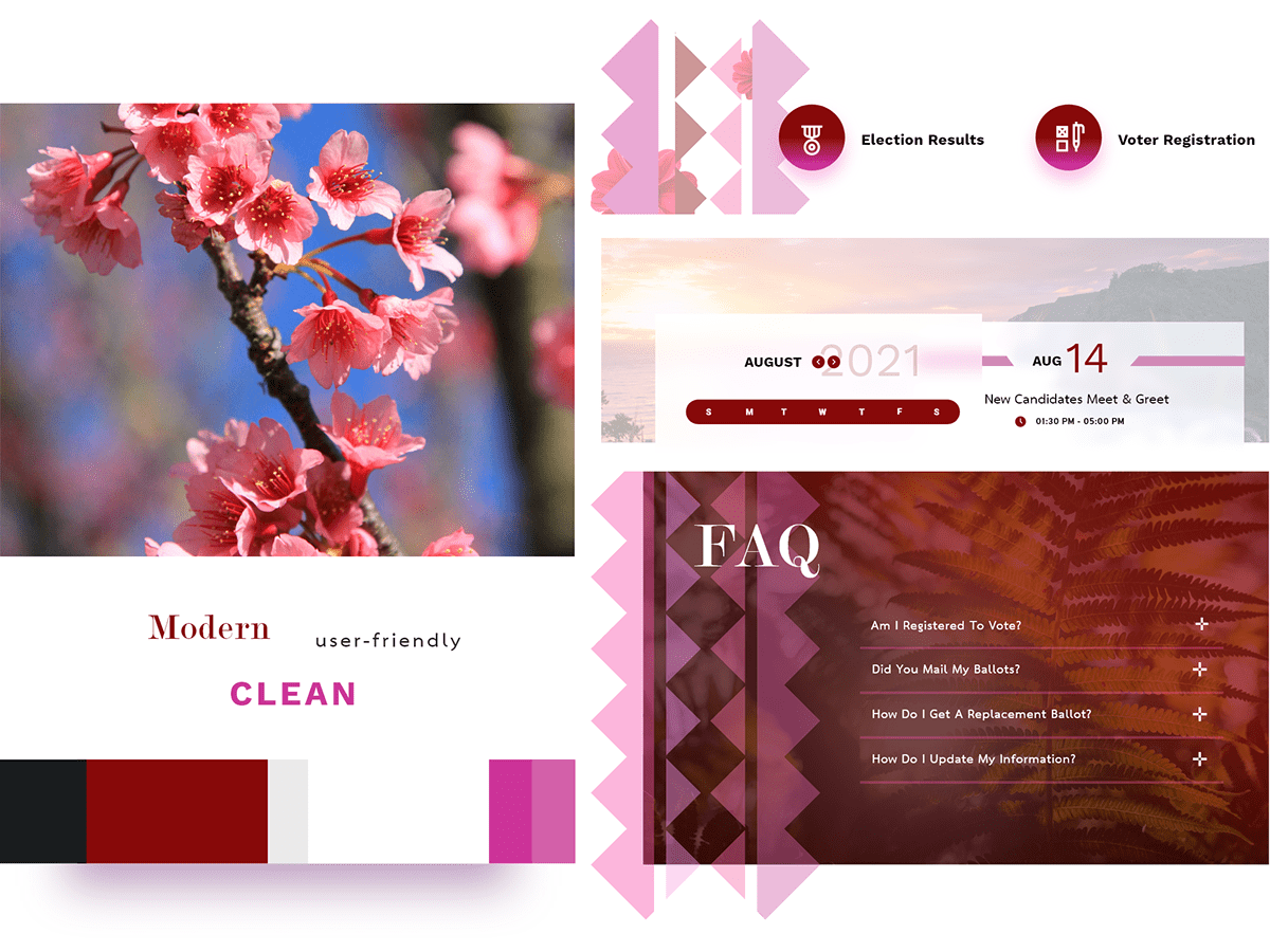
The Style Tiles
Style tiles are a cross between a mood board and a mockup. I designed these small bits prior to the meeting based on limited information. Feedback from these help to inform the initial design and minimize revisions. I basically ask them to rip it apart (tell me what they like & don't like) while I take as many notes as possible.
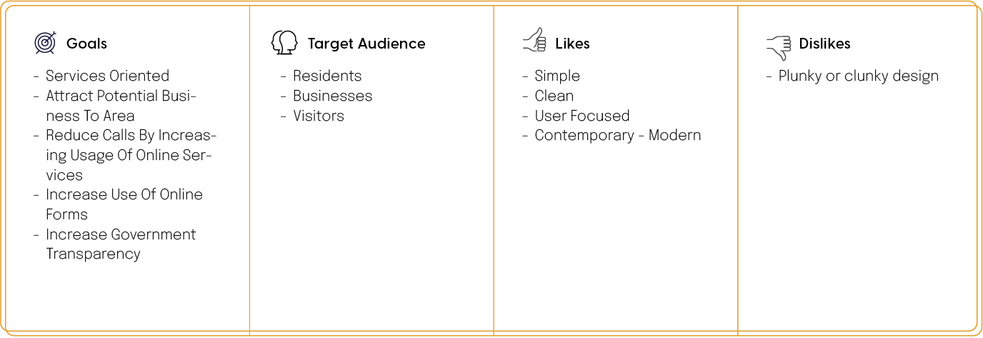
Core Feedback
• Interject more of the color palette into the design with varying hues of blues and gold
• They like how clean the style tiles look
• They like the use of mountains as background elements
• They call themselves "The jewel city" and would like to see that creatively incorporated as a design motif
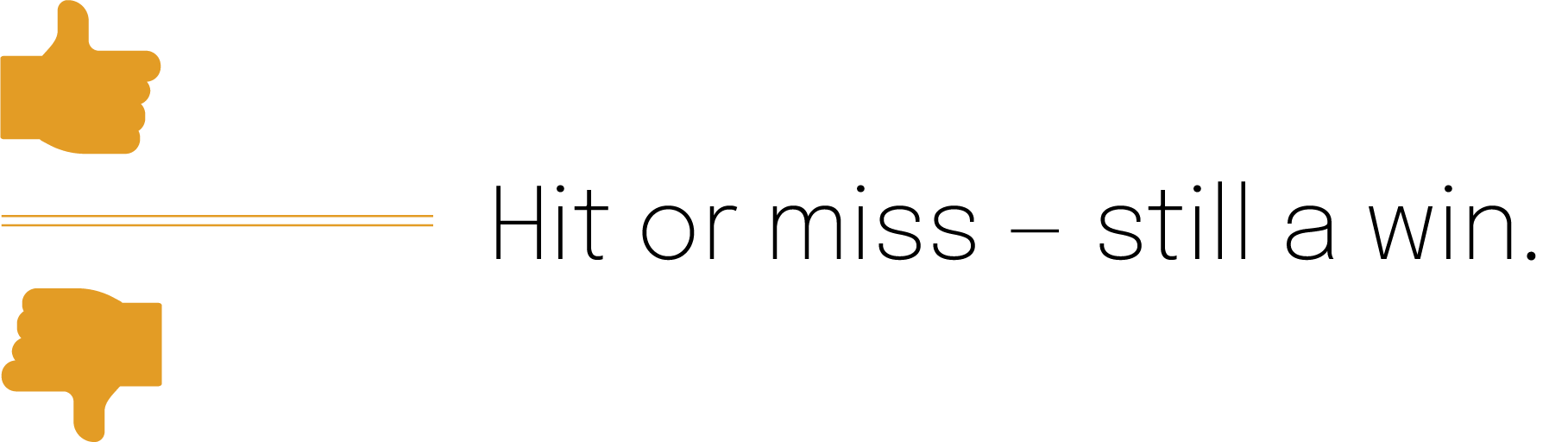
Style tiles reveal crucial feedback: whether the client likes them or not — it's still a win.
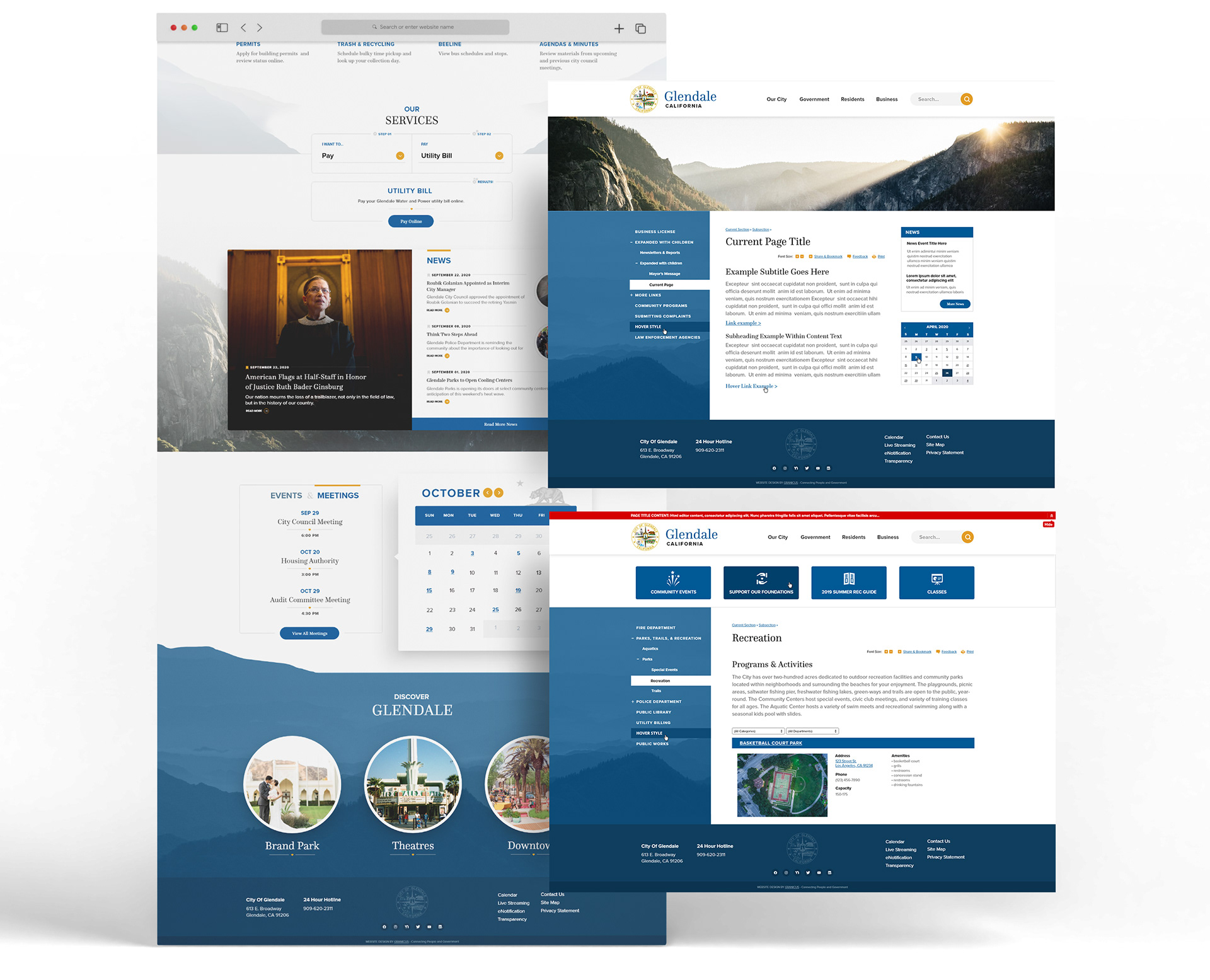
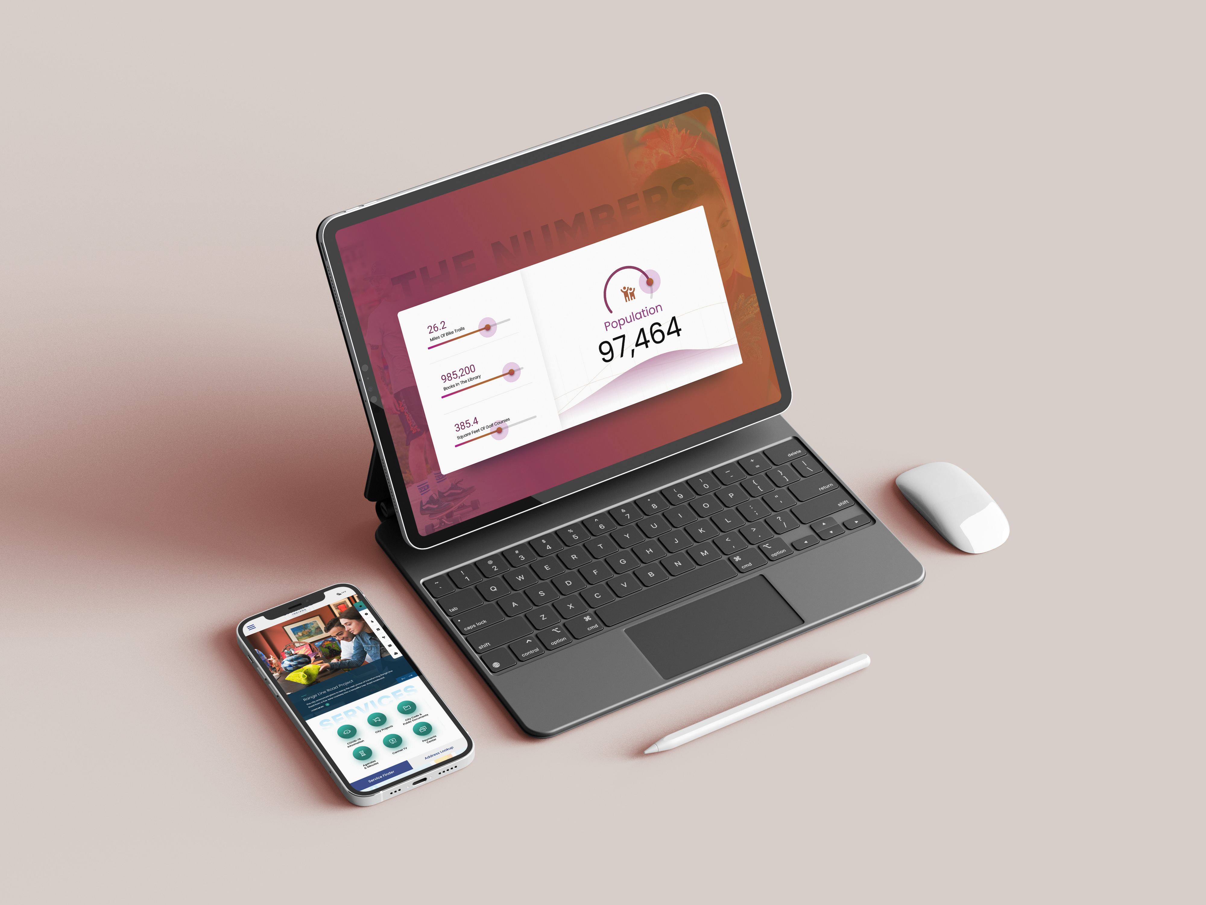
The Design
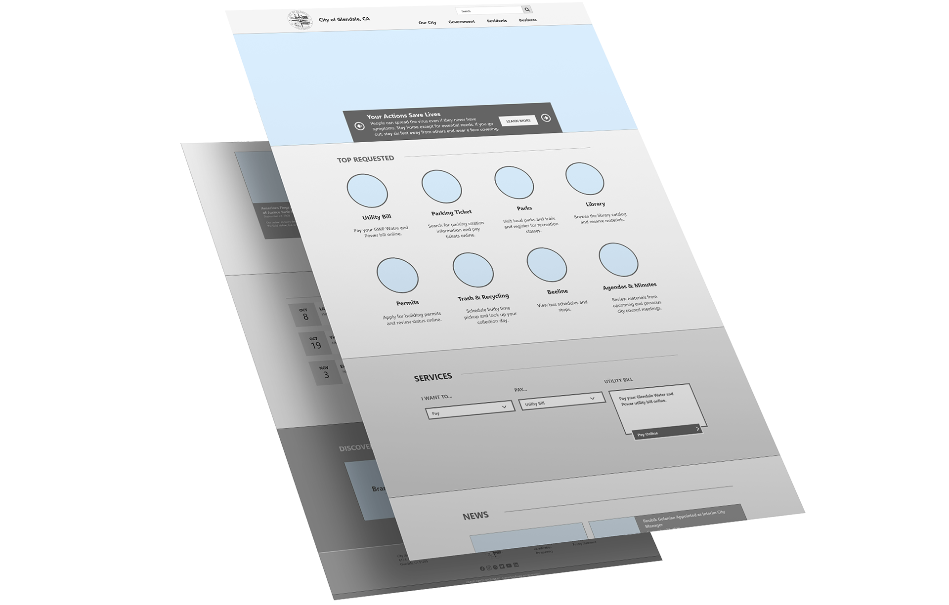
I have enough information to get to work on a full-fledged design. Now it's time for me to translate this wireframe, built by Tony Gillen, into intelligent visual language.
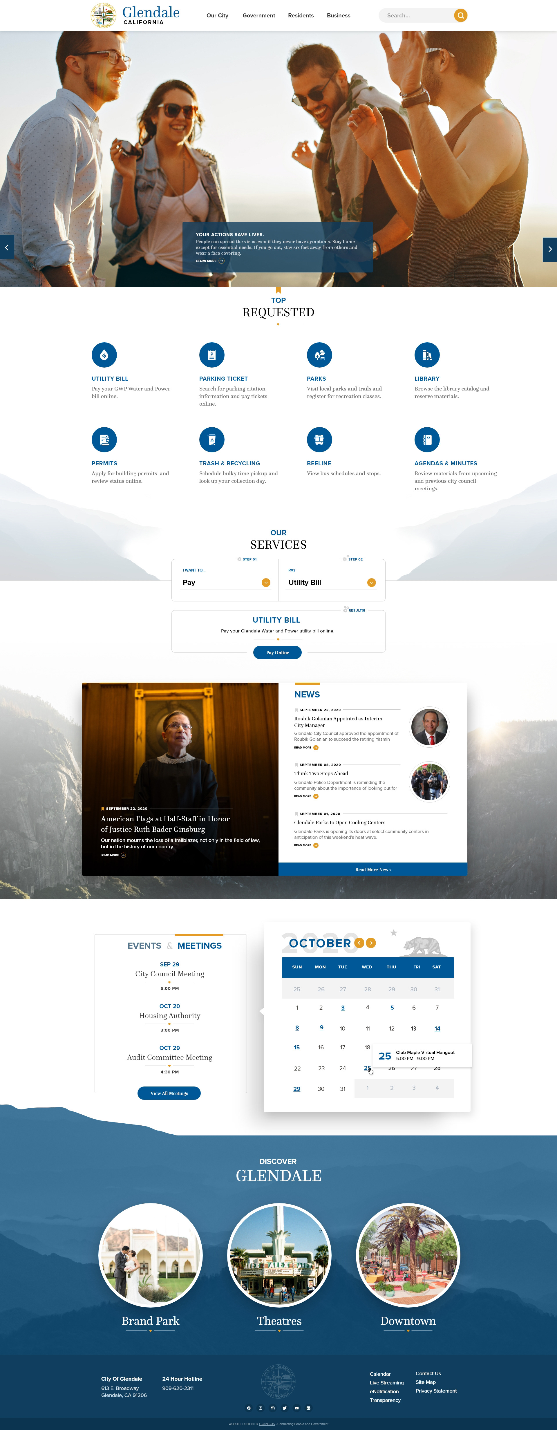
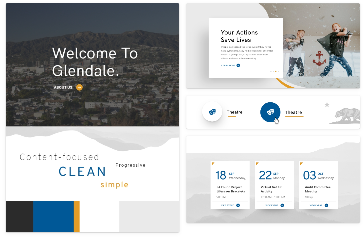
Hero & Most Requested
According to Glendale's design goals, they wanted something simple, clean & user-focused. Simple doesn't have to mean boring — I chose to use the Questa serif font to interject character into the design, I especially like the "Q."
Since this city calls itself "the Jewel city" I made a simple nod to this by adding a small gem shape throughout the design (as can be seen under the word "Requested" in yellow). It was a subtle addition that Glendale liked.
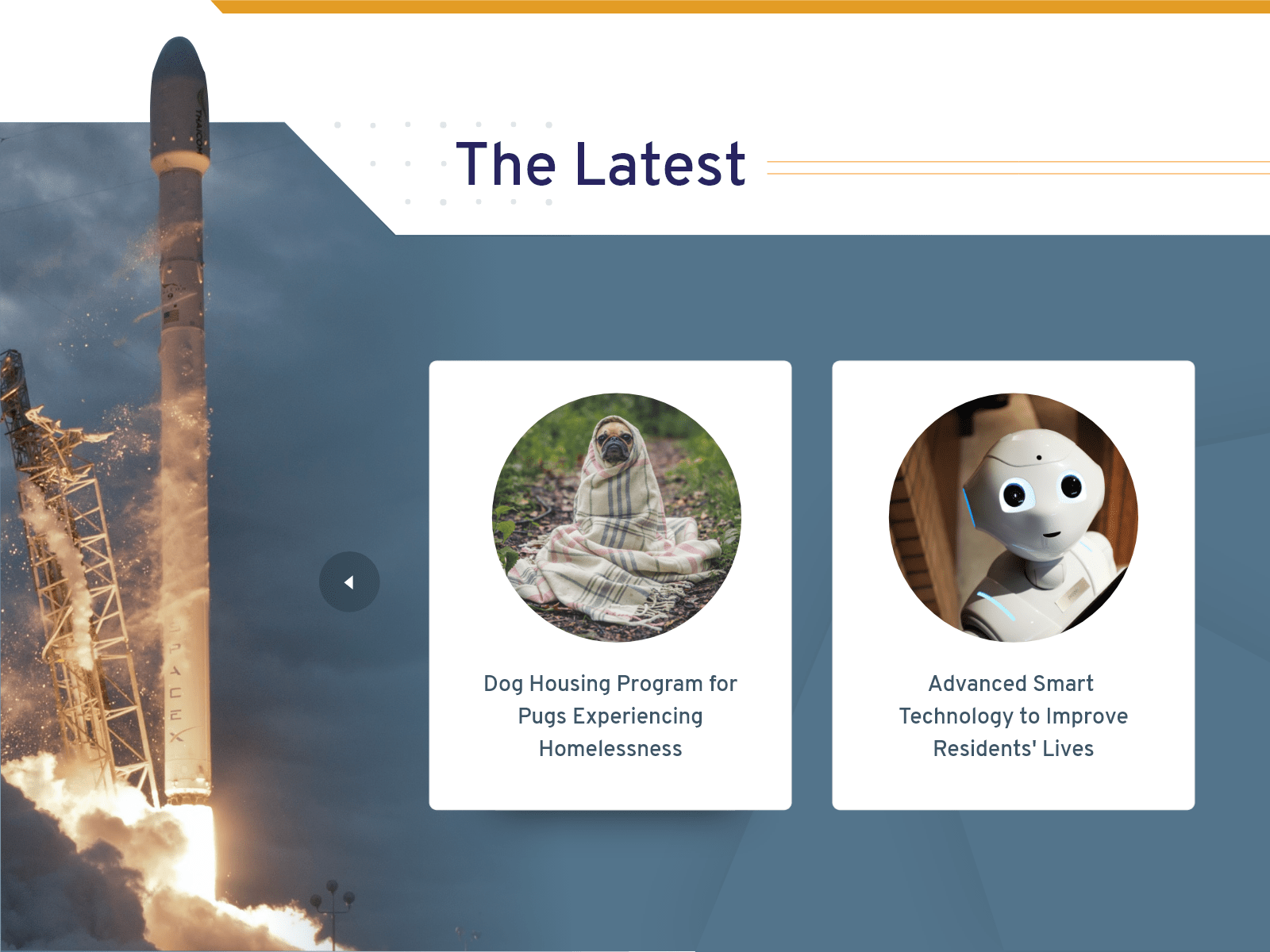
Services & News
The Glendale team wanted the service finder to stand out. Instead of making the service finder scream with bold lines and blocks of color, I silenced everything around it with whitespace — even the mountains are muted. This is an easy way to call attention to task-oriented elements on the screen while also keeping things simple.
The mountains were one of the design motifs Glendale liked from the style tiles. To avoid monotony I presented them differently in the design each time they are present. For example, in the service finder, they are muted but in the heavier news section below they are more obvious.
Last But Not Least
After coming from a visually heavy section above it's time to give the user a visual break. This section is mostly white and uses color only to attract the user's eyes to what is important.
This is a government website redesign, not a product webpage. The focus is a grandmother paying her water bill or your neighbor wanting to come and quickly find out when the next city council meeting is. I say all that to say that it's not about having a flashy design but about users completing a task...
Even so,
On all government website redesigns, I aim to have at least one visually stimulating section. Which is where the "Discover Glendale" section comes in at. Questa gives a lot of character to the section and so do the mountains. I was drawn to how the mountains faded into the back, giving this flat image unique depth. I added the mountain curvature on the top left of the section to accentuate that depth. This is another example of what I call a "dimension break" (as mentioned in my other case studies).
Interior Pages