The Conversation
A design consulting workshop is my favorite way of building empathy with the client. Some people call this a consulting workshop. The Lancaster team told me they are known as the Antelope Valley and their city may have been named after a train stop 🤷🏾♂️ lol
Here are some initial insights from the workshop:
The Style Tiles
A crucial part of our conversation; think of style tiles as a cross between a mood board and a mockup. I designed these small bits prior to the meeting based on limited information. Feedback from these help to inform the initial design and minimize revisions. I basically ask them to rip it apart (tell me what they like & don't like) while I take as many notes as possible.
Sometimes they do very well at ripping it apart.
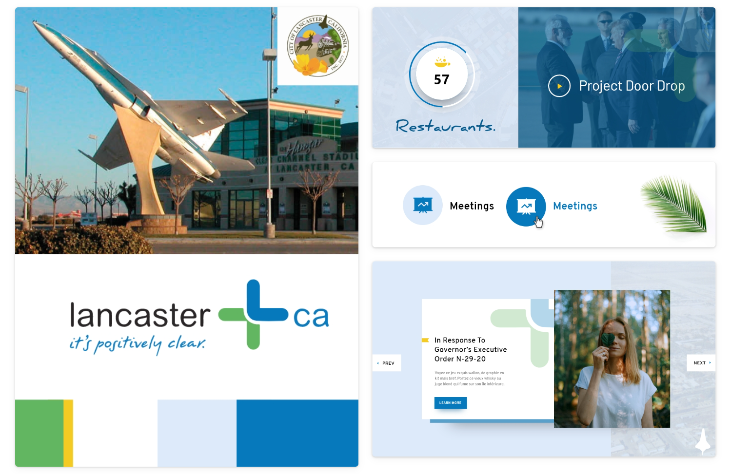
Core Feedback
• They are currently going through a rebrand, so the color palette will need to totally change.
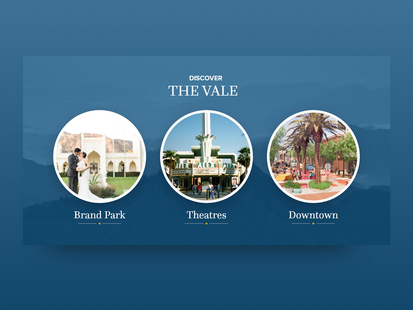
• They want to use circular imagery.
• They prefer buttons with rounded edges.
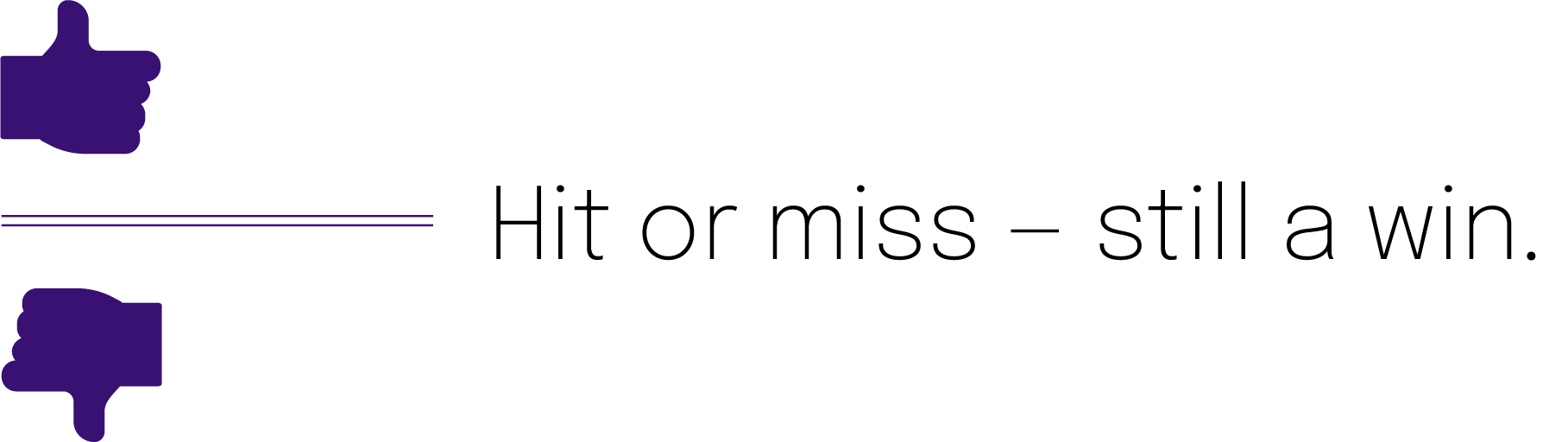
I got loads of information that helped me to aim for the sweet spot in the full initial design. Style tiles reveal crucial feedback: hit or miss — it's still a win.

The Design
I have enough information to get to work on a full-fledged design. Now it's time for me to translate this wireframe, built by Tony Gillen, into intelligent visual language.
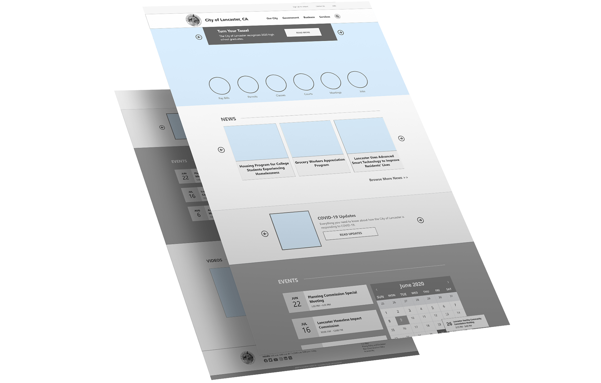
The Old
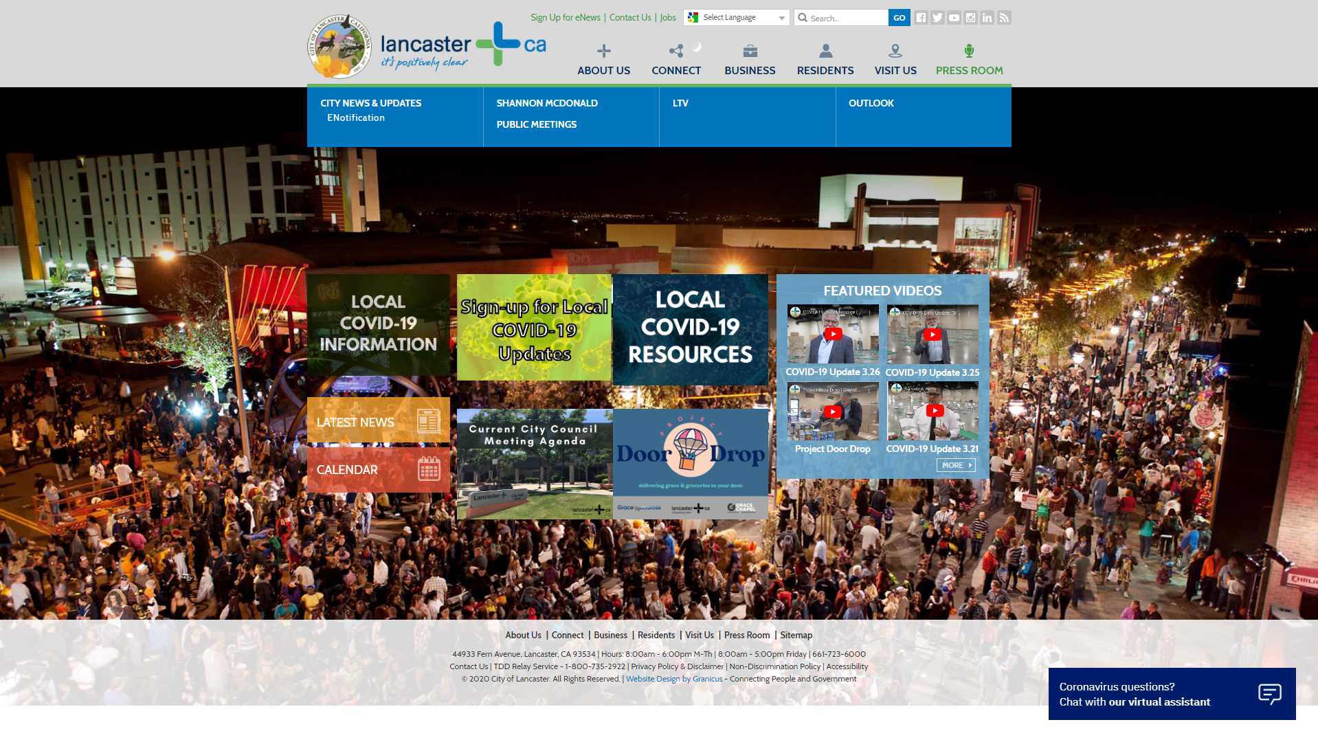
The New
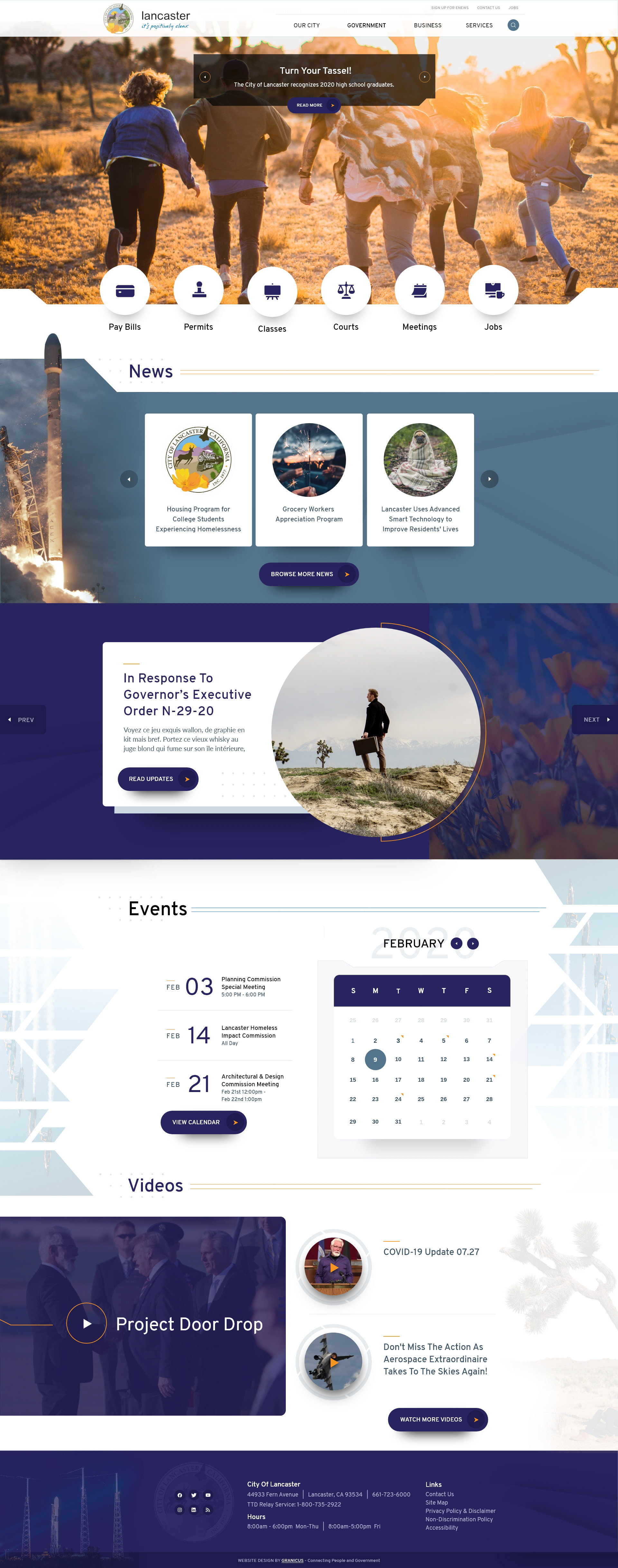
Overview
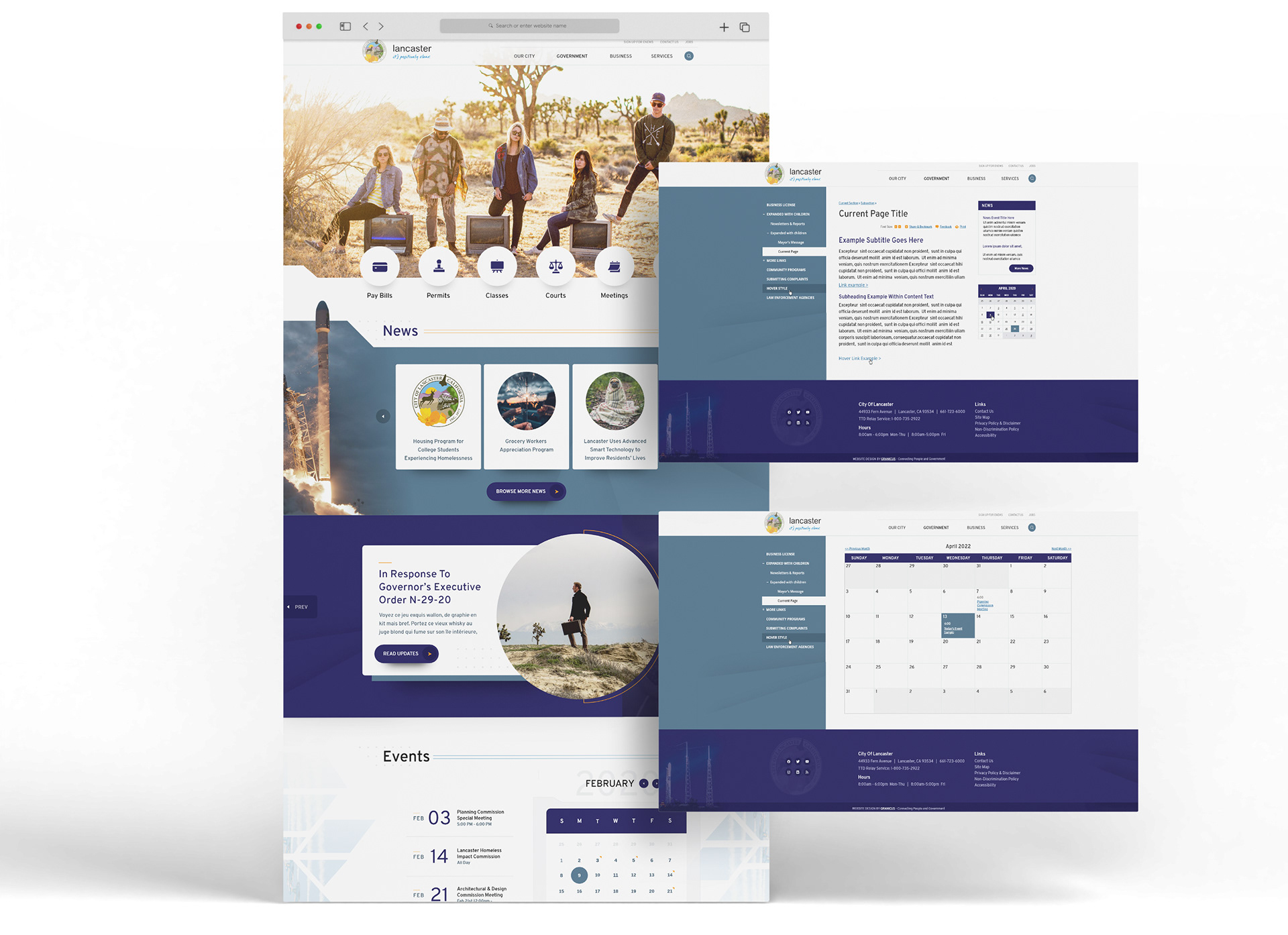
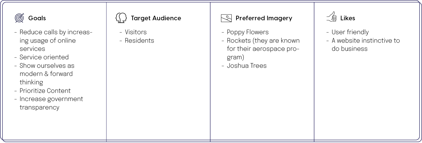
Lancaster, CA takes pride in their aerospace program, poppy flowers, and Joshua trees. Throughout the design, I was challenged with incorporating both these mechanical and organic design elements. I used sharp edges and angles to establish a "techy" feel.
News
Aside from establishing a "techy" feel, angles in UI design can also serve as a visual cue to push users down the page. I use one of my favorite design techniques in this section, where the part of an image extends beyond its bounding frame. I call the use of this technique dimension breaks. I may not be the first one to use this technique, but I use it enough in my personal work to have a name for it :)
Spotlight
Soft background imagery helps to add interest without distracting from important copy. I chose to incorporate natural elements, like poppy flowers and Joshua trees into the background imagery of the site. This is a way for the mechanical and organic design elements to complement each other rather than clash.
Events
Continuing with the goal of creating a design that plays on Lancaster's techy side I added angled geometry to the sides. Once again, the angles in this design have a dual purpose, not only to read as tech-like but also to push the user down the page.
Videos
This design isn't all about sharp edges. The rounded corners used throughout the design give the website a welcoming and friendly feel. And look at that! There's the Joshua tree unobtrusively in the background! Rockets. Check. Poppy flowers. Check. Joshua trees. Check. Mission accomplished.
Interior Pages