The Conversation
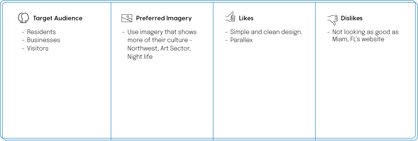
A design consulting workshop is my favorite way of building empathy with the client. During my conversation with the Fort Lauderdale team, we spoke about their goals and aesthetic preferences. Here are some initial insights:
The Style Tiles
A crucial part of our conversation; think of style tiles as a cross between a mood board and a mockup. I designed these small bits prior to the meeting based on limited information. Feedback from these help to inform the initial design and minimize revisions. I basically ask them to rip it apart (tell me what they like & don't like) while I take as many notes as possible.
Core Feedback
• They liked the incorporation of elements of their logo into the design
• The really like the color palette, and how it feels.
• The call-to-action buttons are to "blah" (meaning not exciting enough)
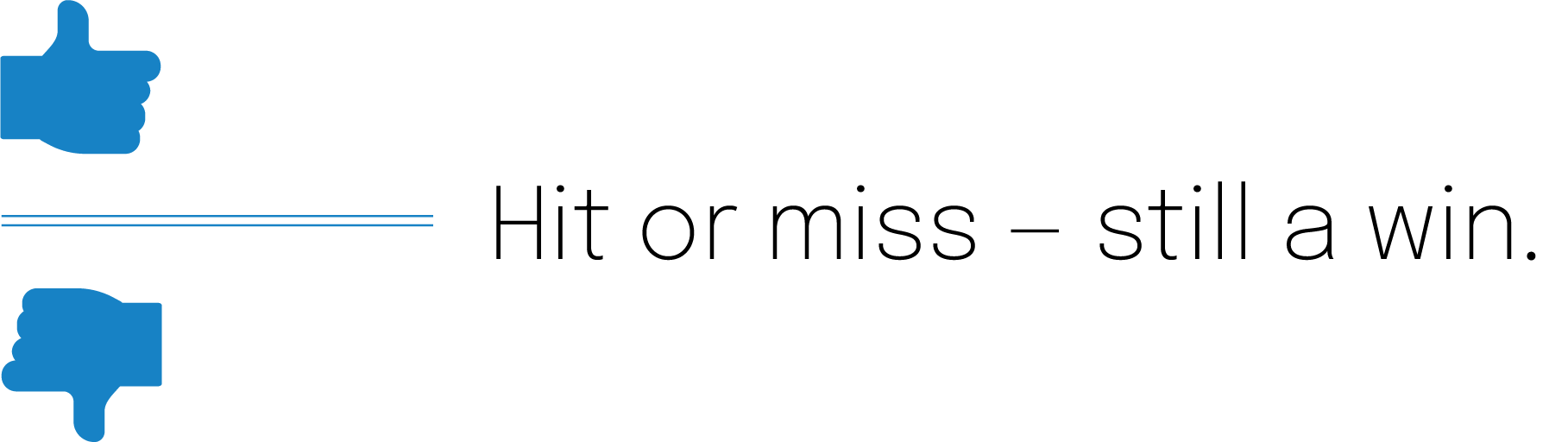
Showing the style tiles triggered a lot of feedback, good and bad. Either way, I got loads of information that helped me to aim for the sweet spot in the full initial design. Style tiles reveal crucial feedback: hit or miss — it's still a win.
The Design
I have enough information to get to work on a full-fledged design. Now it's time for me to translate this wireframe, built by Tony Gillen, into intelligent visual language.
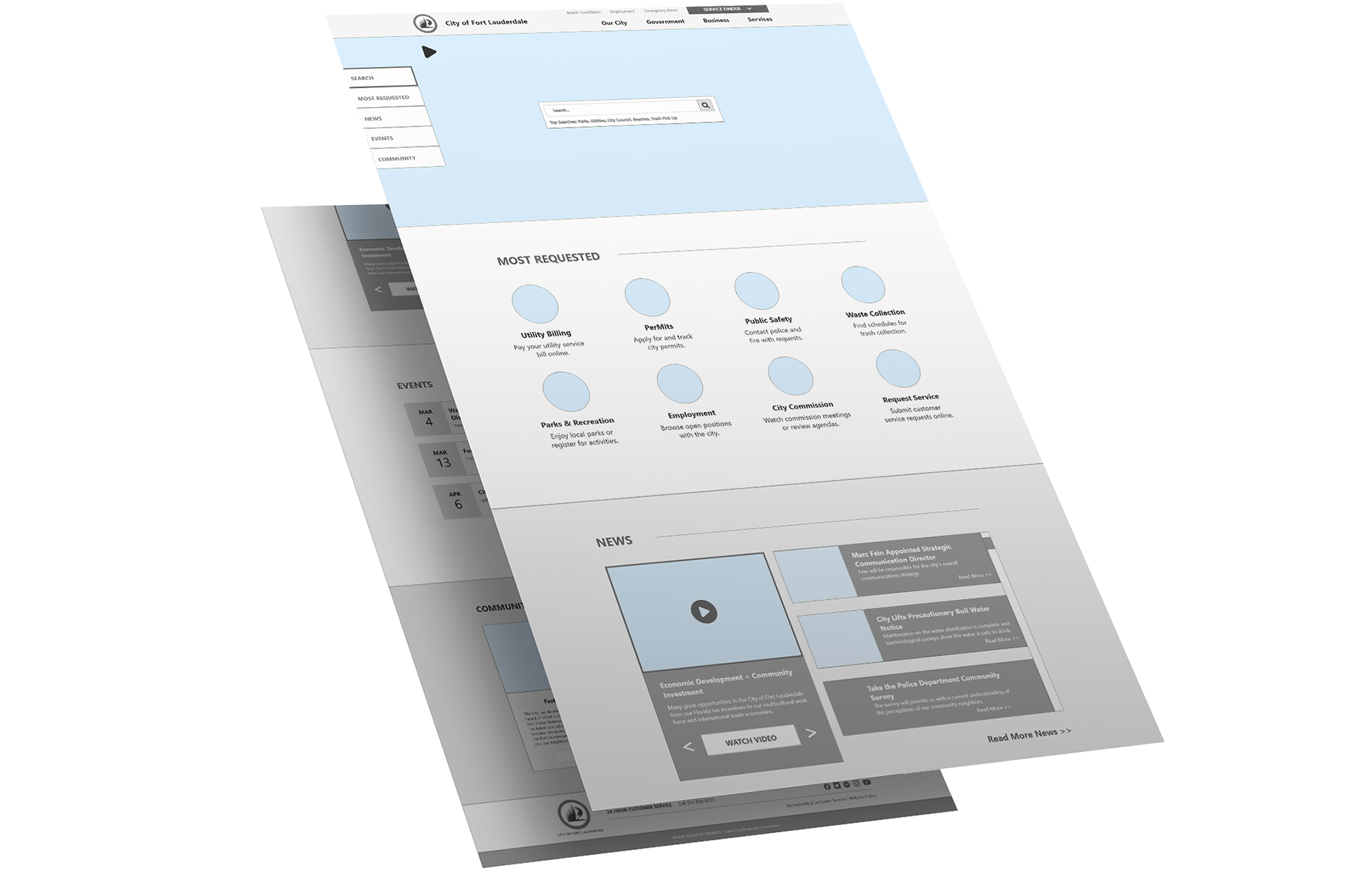
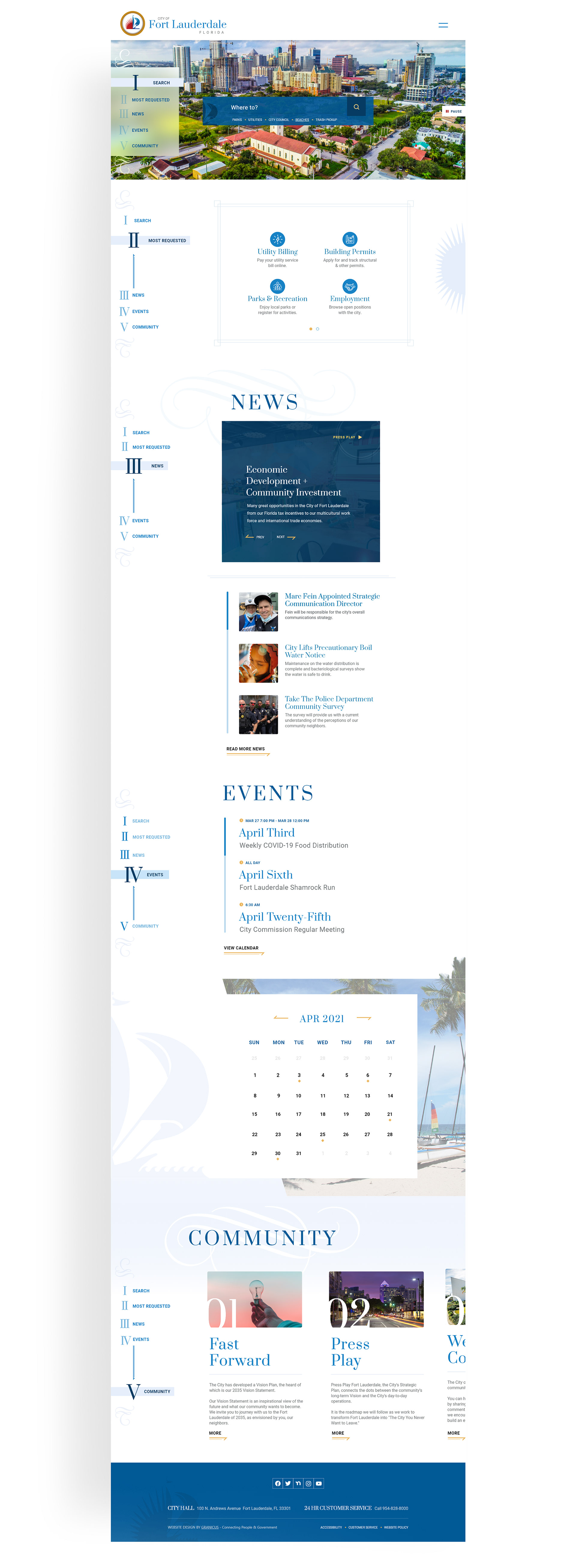
Overview
Ft. Lauderdale wanted to compete with Miami's website. They wanted a simple and clean design, so I didn't go overboard with loads of graphics and background imagery. I used a serif font and some elegant flourishes throughout the design to establish a sense of sophistication and luxury, but not too much — it still needed a laid-back beach vibe. Fort Lauderdale is known as "The Venice of America."
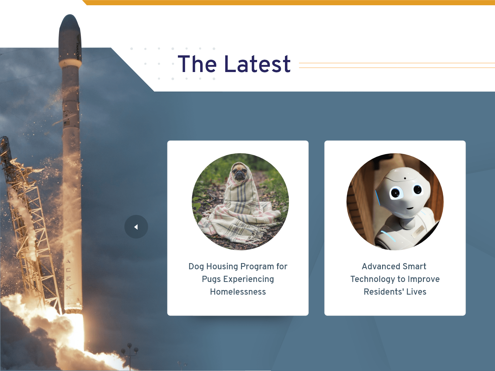
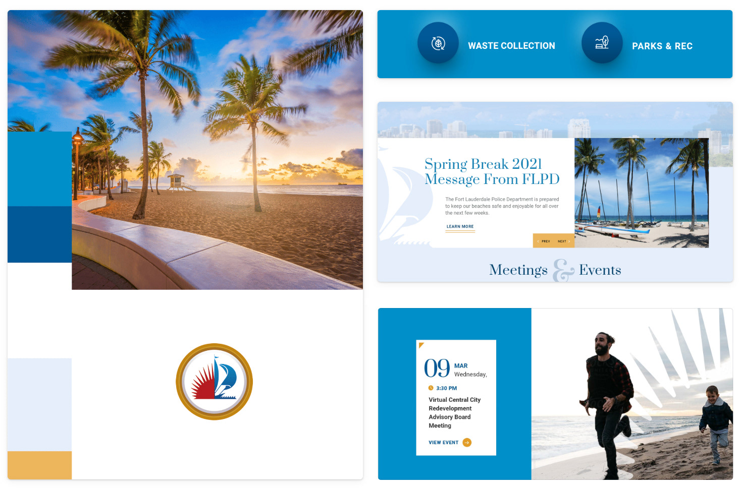
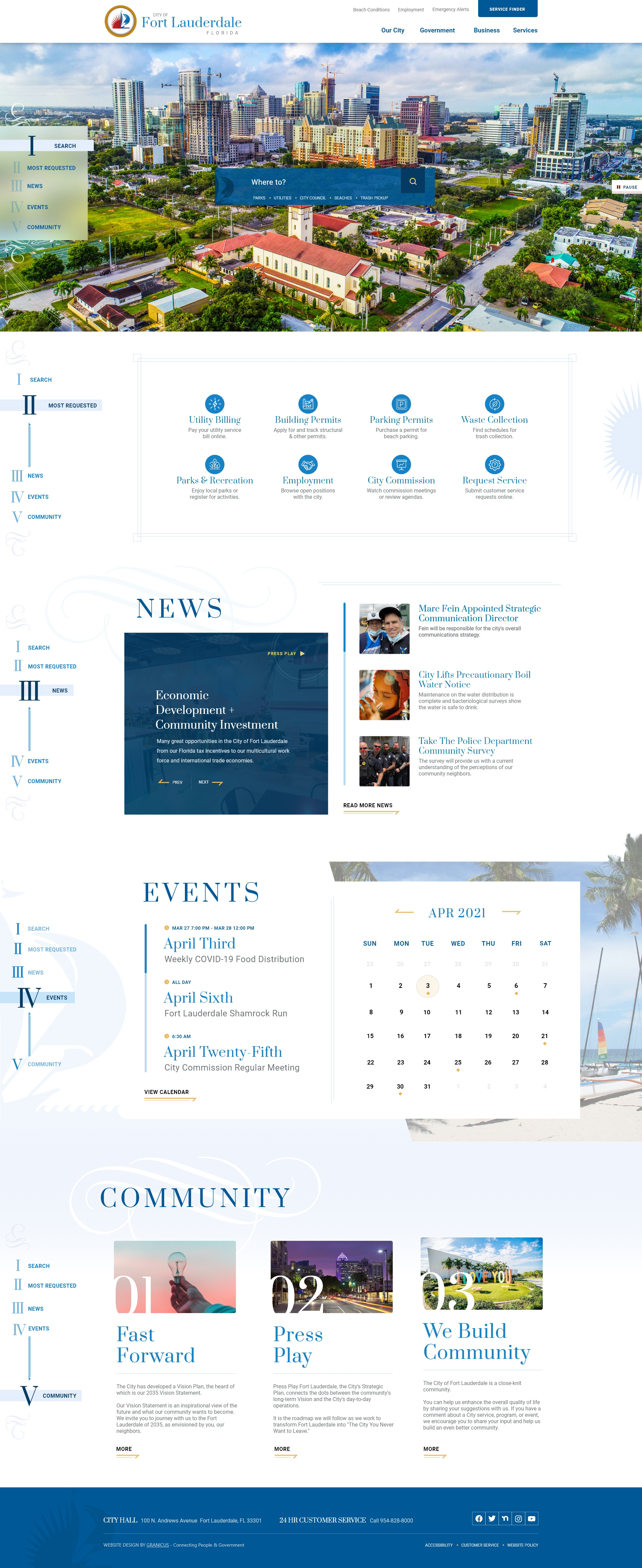
Most Requested Links
The focus of this section are the 8 most requested links from the website so I decided to keep this section simple. The sun graphic on the right is from their logo, I used the symbols from their logo throughout the design to reinforce their branding.
News
The flourish behind the news heading is here to give this section a touch of sophistication. The main story to the left is the pinned story, giving it the navy overlay put it at the top of this section's visual hierarchy.
Events
Drop-shadows aren't the only way to give your design depth. I added dimension to this section by stacking visual elements. The calendar overlaying the picture, which overlays the background color of the next section is some cool flat layering that gives this section depth without a single drop shadow!
The palm tree coming out of the picture bounds also adds dimension to this section - this is one of my favorite techniques, I call them dimension breaks. It's a personal style that I use in a lot of my work. Dimension breaks can be subtle and still deliver a lot of impact in a design.
A Challenge
This section was a challenge for me because the client wanted to include SO much text. Scaling elements above the body copy like the: number, title, and picture balanced each article so that the 7 lines of text don't seem so overbearing.
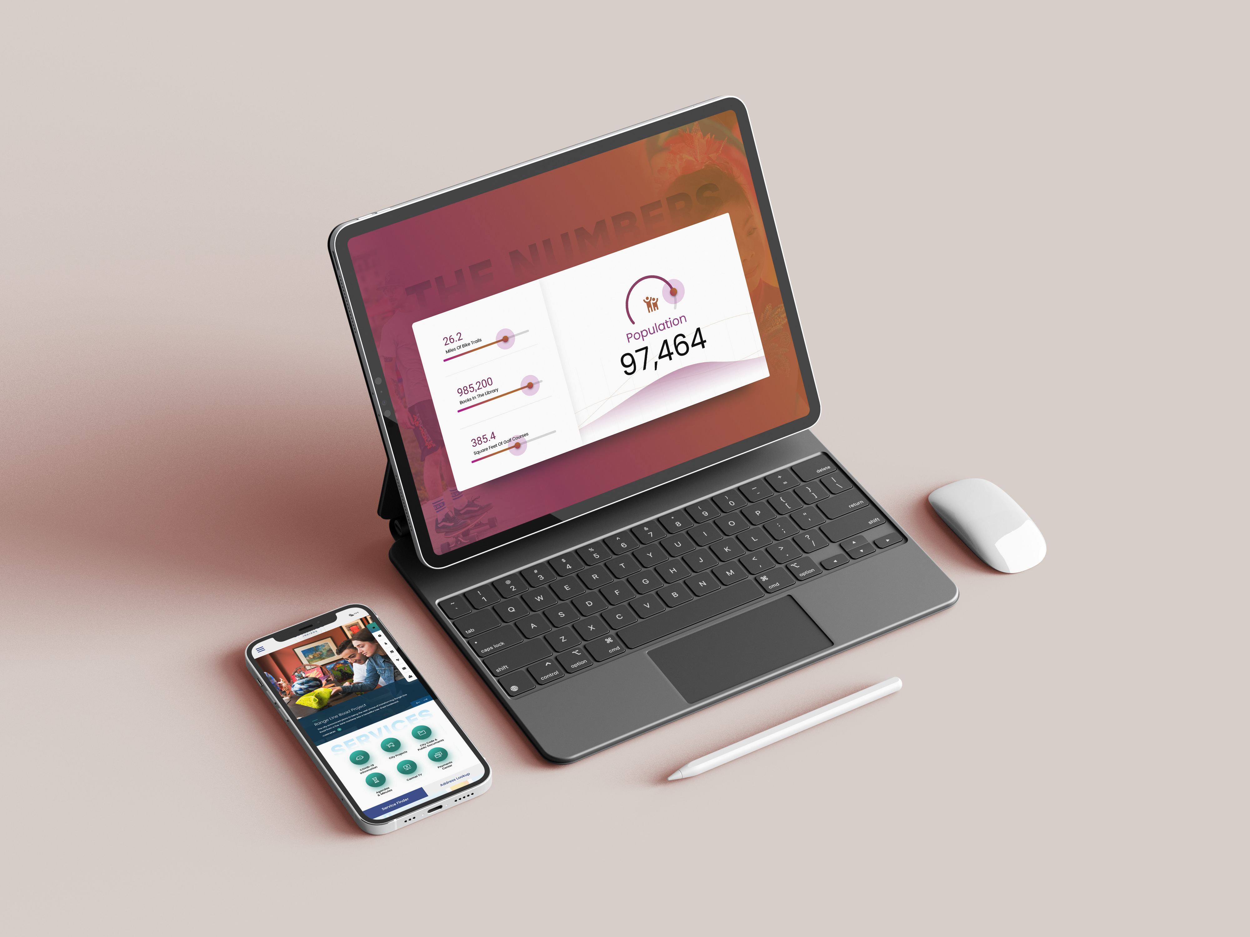
Interior Pages

Tablet View
Mobile View
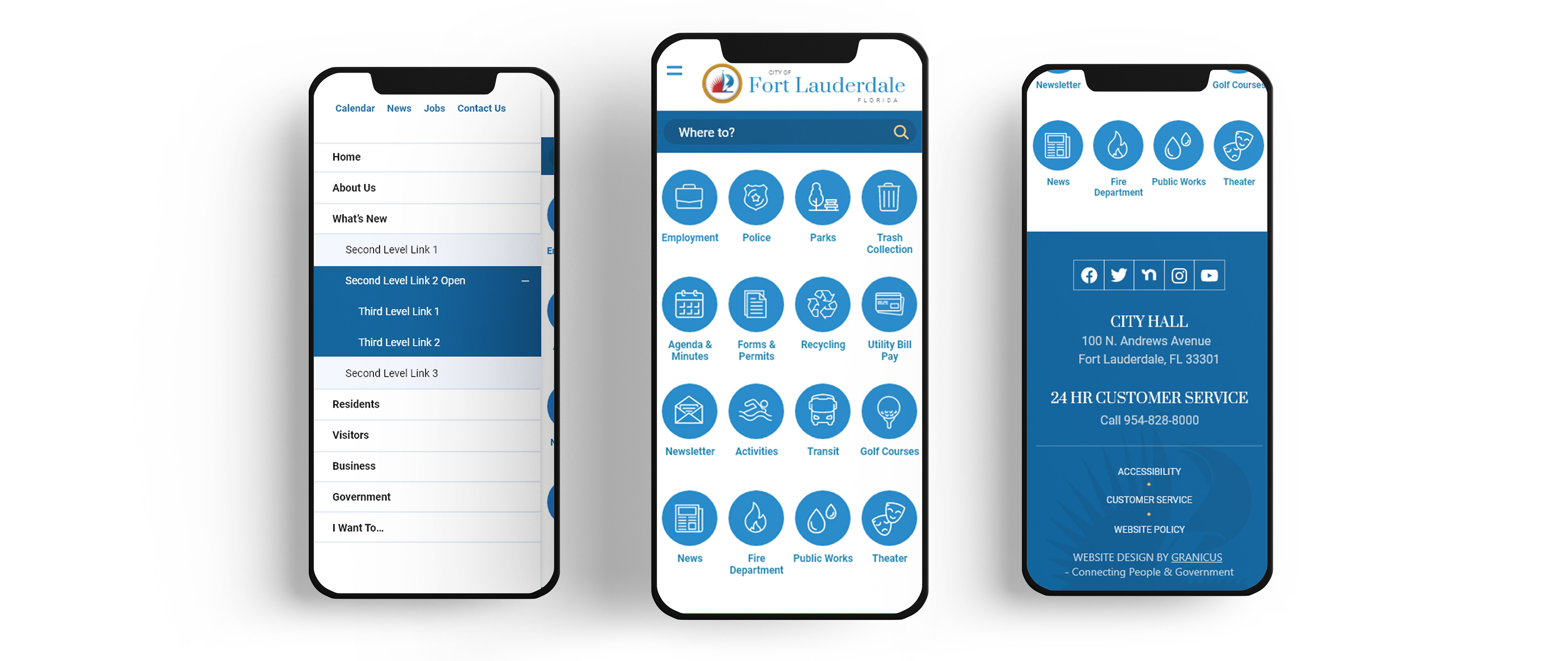
Responsive isn't always the answer.
Instead of asking if responsive or adaptive design is better, you should be asking which is better for the project. Based on your audience and analytics it may be better to go the adaptive route like below.
This mobile view for Fort Lauderdale takes a task-based approach where the user is presented with call-to-action buttons to get where they need to go immediately instead of scrolling the length of a responsive webpage layout.