Hawai'i County Office of The County Clerk Elections Division
County-level elections office responsible for voter registration and issuing and receiving of mail-in ballots.

The Conversation
After viewing the client's brief and user research on my machine, it's time for a conversation with the human(s). This is my favorite way of building empathy with the client. Some people call this a consulting workshop.
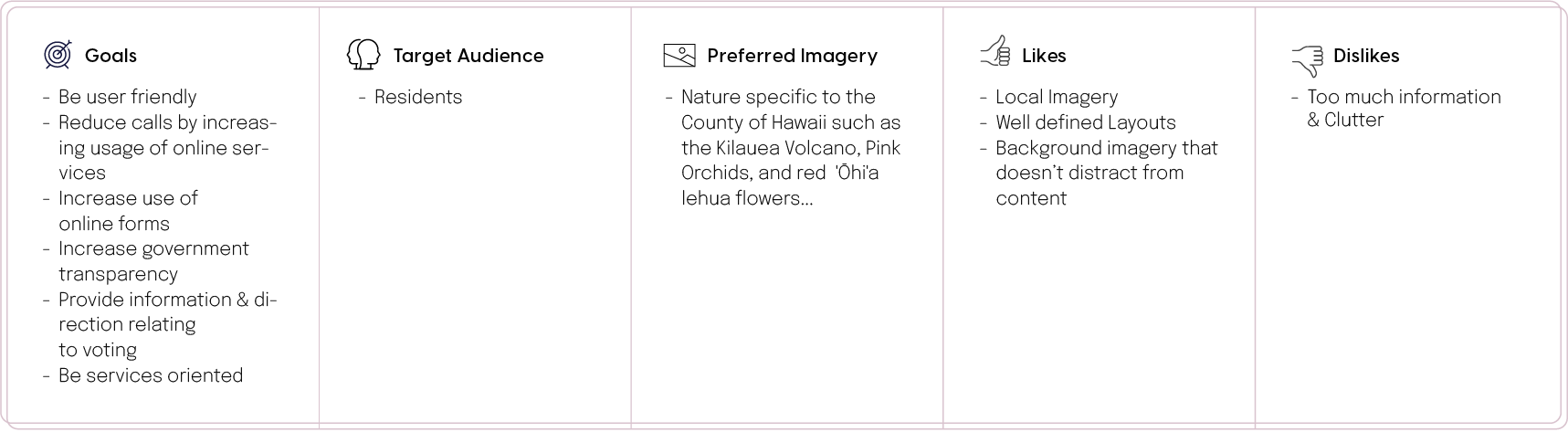
I don't live in Hawaii. Have you ever had a client meeting with a 7-hour timezone difference? I have. During my conversation with the Elections Division team, we spoke about their goals and aesthetic preferences. Here are some initial insights:
The Style Tiles
A crucial part of our conversation; think of style tiles as a cross between a mood board and a mockup. I designed these small bits before the meeting based on limited information—feedback from this helps to inform the initial design and minimize revisions. I basically ask them to rip it apart (tell me what they like & don't like) while I take as many notes as possible.
Sometimes they do very well at ripping it apart.

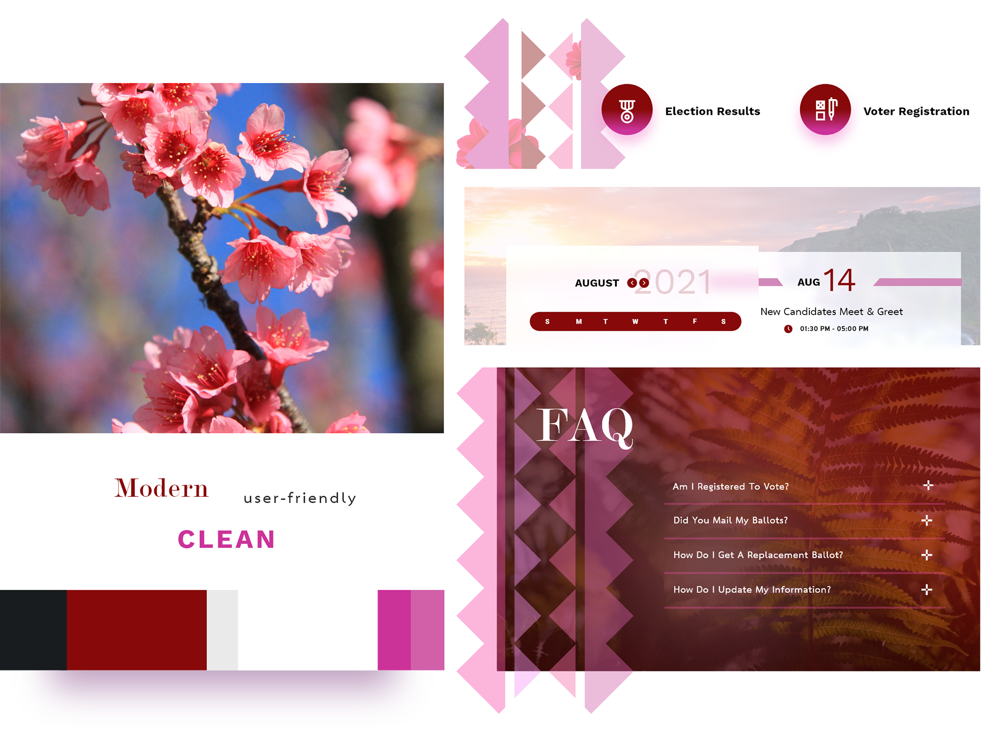
Core Feedback
• The serif font is "cute." (this means use it)
• The red & fuchsia are too strong — aim for a muted color palette.
• They like the colors and feel of the muted imagery behind the calendar snippet.
Showing the style tiles triggered a lot of feedback, good and bad. Either way, I got loads of information that helped me to aim for the sweet spot in the full initial design. Style tiles reveal crucial feedback: hit or miss — it's still a win.
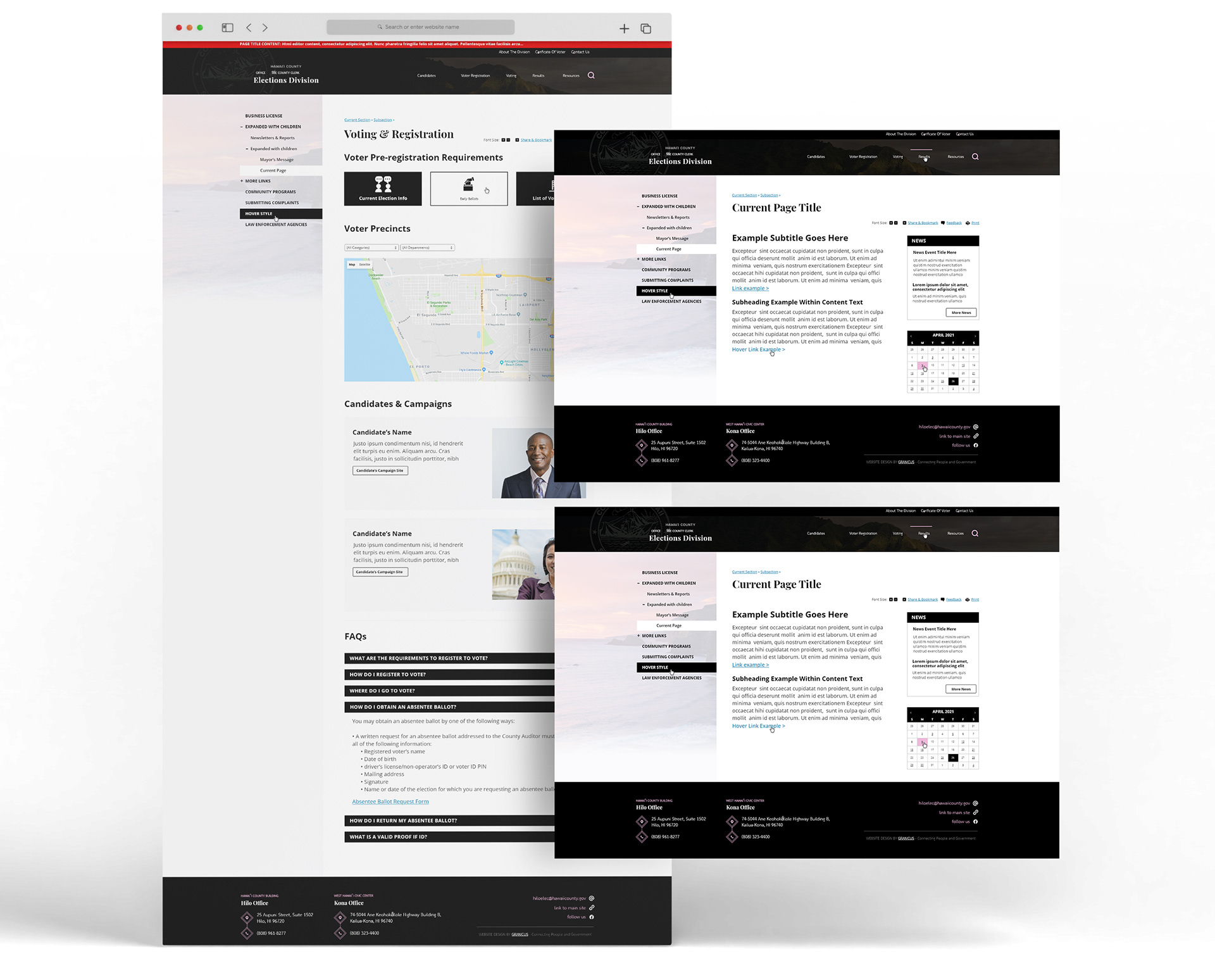
The Design
I have enough information to get to work on a full-fledged design. Now it's time for me to translate this wireframe, built by Grant Hasbrouck, into intelligent visual language.
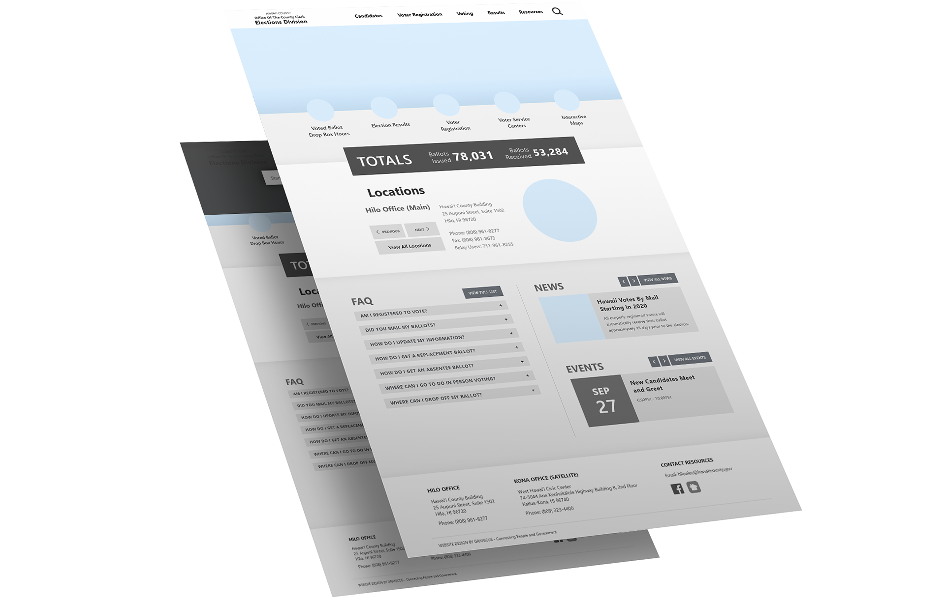

Here is the visual transformation of the wireframe.
Continue to scroll for a breakdown of my design decisions.
Continue to scroll for a breakdown of my design decisions.
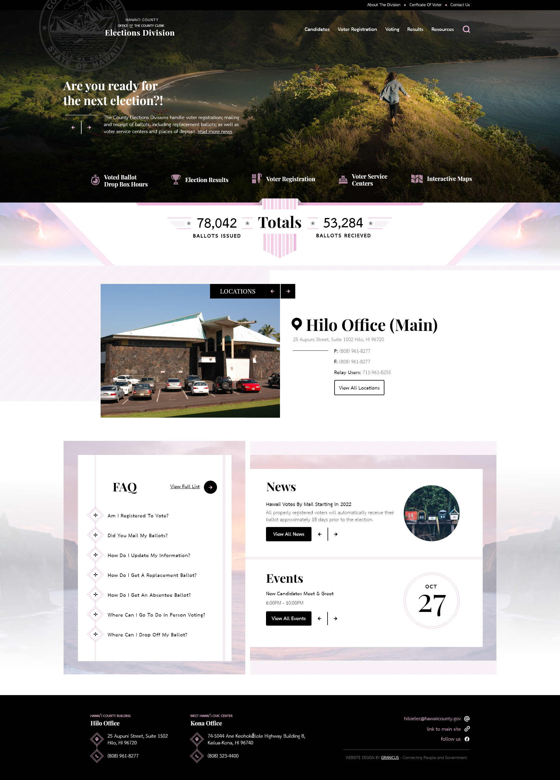
Above The Fold
The client wanted images of the nature of Hawaii and muted colors. I chose to also incorporate black to mature the color palette. Black contrasted well with the muted colors - ensuring the page wasn't washed out and also giving me a strong visual cue to draw the user's attention to call-to-action buttons.
The client wanted the caption higher in the visual hierarchy than both the logo and call-to-action buttons below it. So I watermarked the seal in the header and muted the CTA icons to push them further into the background. They also didn't want the search to stand out, so its presence is simply a flat icon.
The data visualization of the ballots was really important to them and needed to stand out. The protruding ribbon in the middle adds some dimension and the volcanoes on the side make this area more visually interesting (including nature from Hawaii throughout the site was a big deal for them).
Locations
The arrows used to navigate between sections were important, but instead of making them big, I used the black I newly incorporated into the color palette to make them stand out in stark contrast with the white background.
A Challenge
I faced a challenge with having the FAQ, News, and Events all packed into one section. I used white space to keep this section from getting cluttered. Using the muted imagery also acted as a border between these three areas to give them distinct separation and breathing room.
Also, I wanted the global footer to be a strong anchor for the site and chose to use black primarily. The pink used on the black in the footer is easier on the eyes than solely using white. I reserved the white for the items that I wanted to stand out, helping me to establish a tidy visual hierarchy for the footer.
Interior Pages