The Conversation
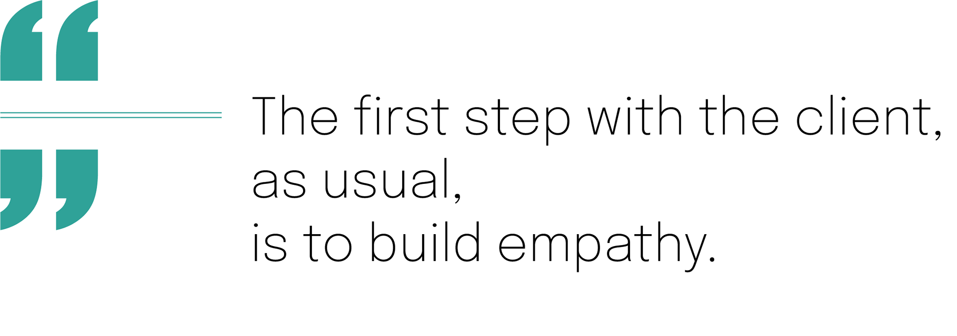
After viewing the client's brief and user research on my machine, it's time for a conversation with the human(s). This is my favorite way of building empathy with the client. Some people call this a "consulting workshop."
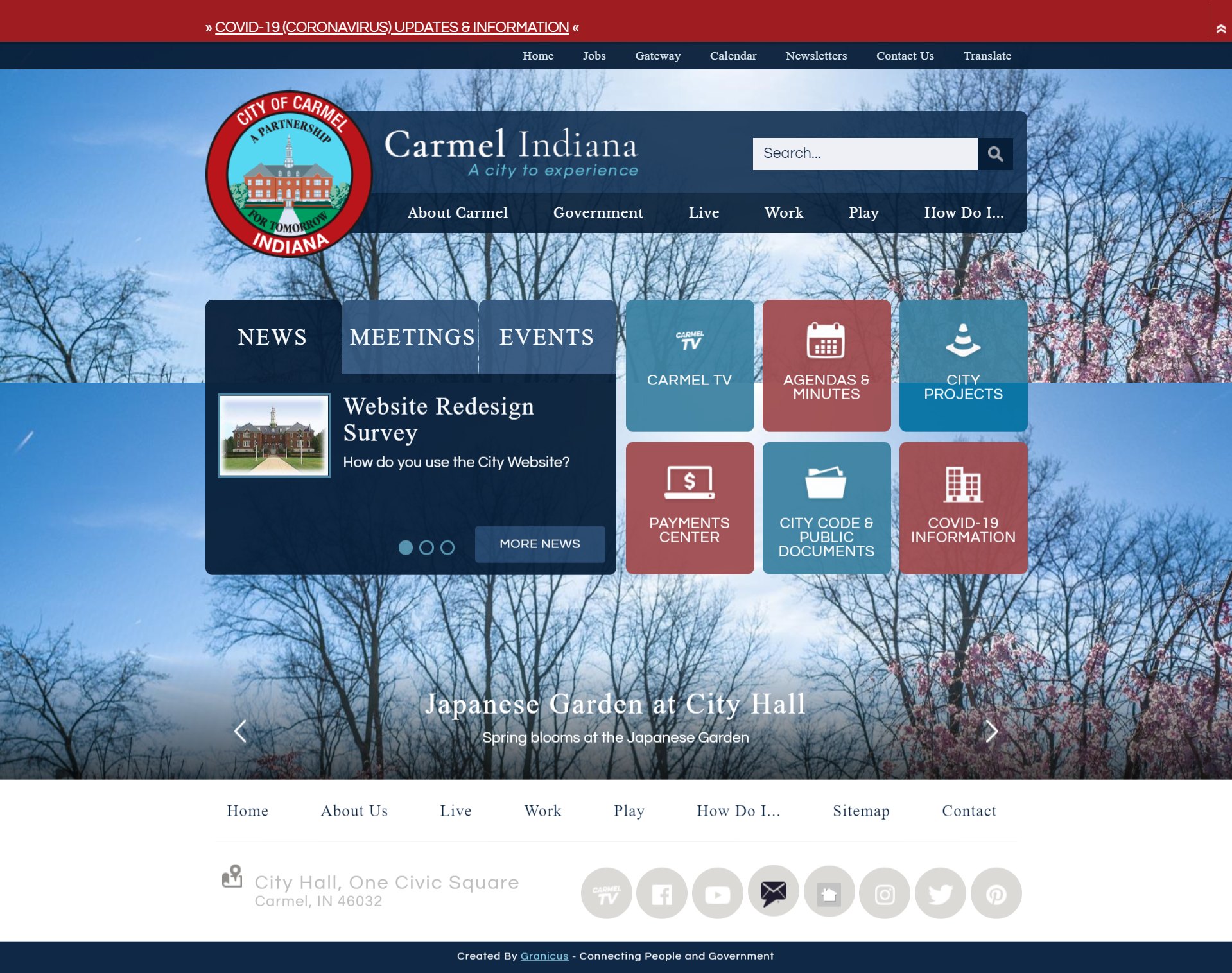
During the workshop, I asked them key questions about their target audience, design goals, and aesthetic preferences. I also like to ask them if there is anything they would like to retain from their old design (pictured below)
The Style Tiles
Now it's time for the style tiles, a crucial part of our conversation. Think of style tiles as a cross between a mood board and a mockup. Feedback from these help to inform the initial design and minimize revisions.
Core Feedback
• They like the use of whitespace, giving it a clean appearance.
• They like the 3D bevel of the buttons, but the icons are too small.
• Rust Orange is apart of their branding, but they are ok with it only being present in background imagery in the redesign.
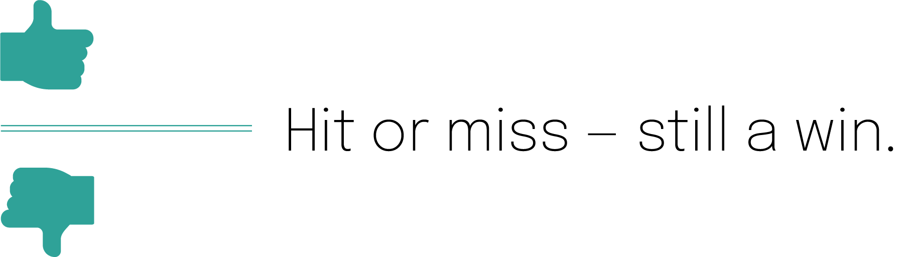
Style tiles reveal crucial feedback whether they are a hit or miss with the client.
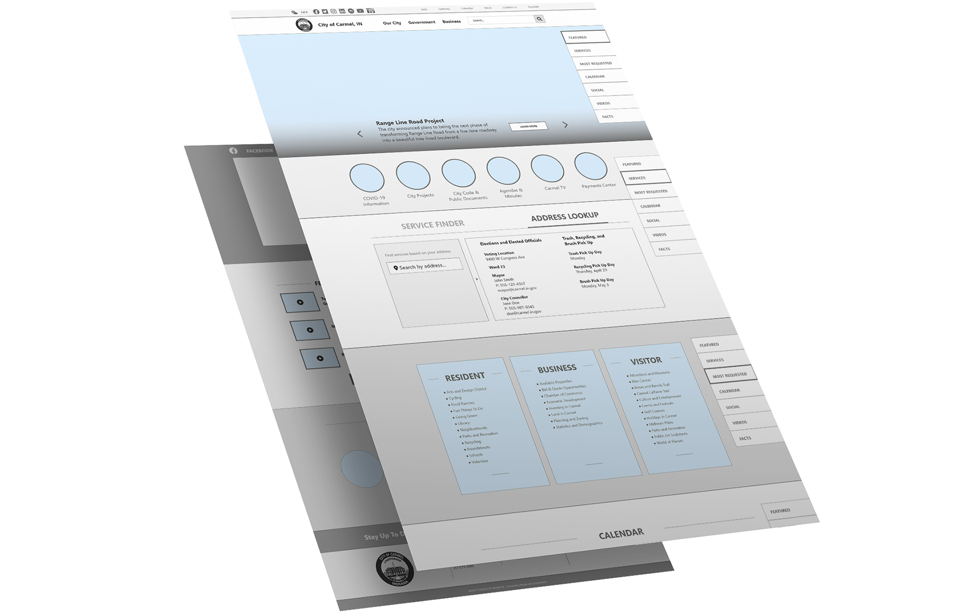
The Design
I have enough information to get to work on a full-fledged design. Now it's time for me to translate this wireframe, built by Tony Gillen, into intelligent visual language.
The Old
The New
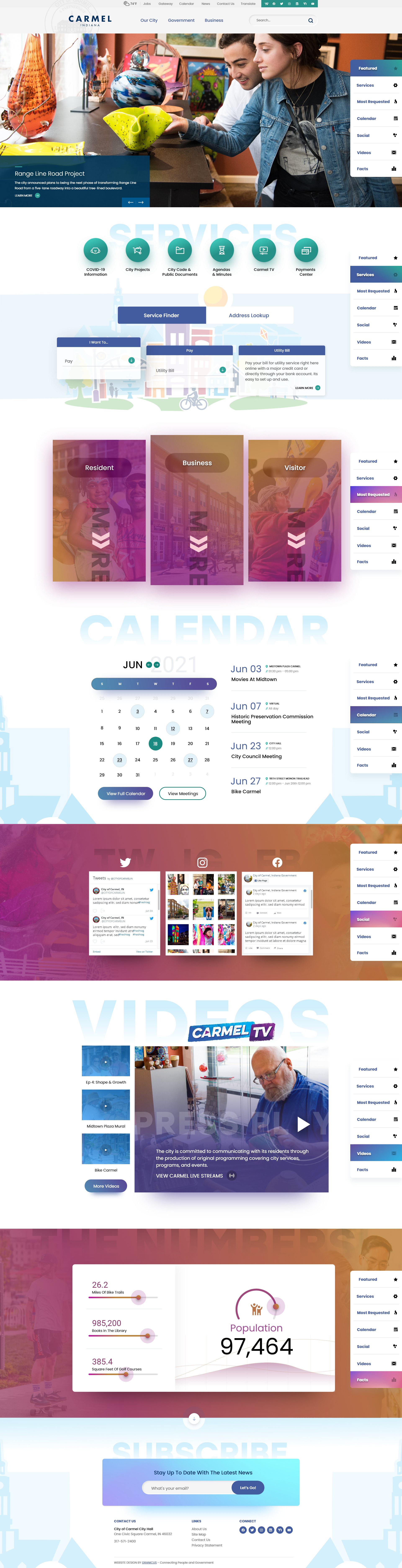
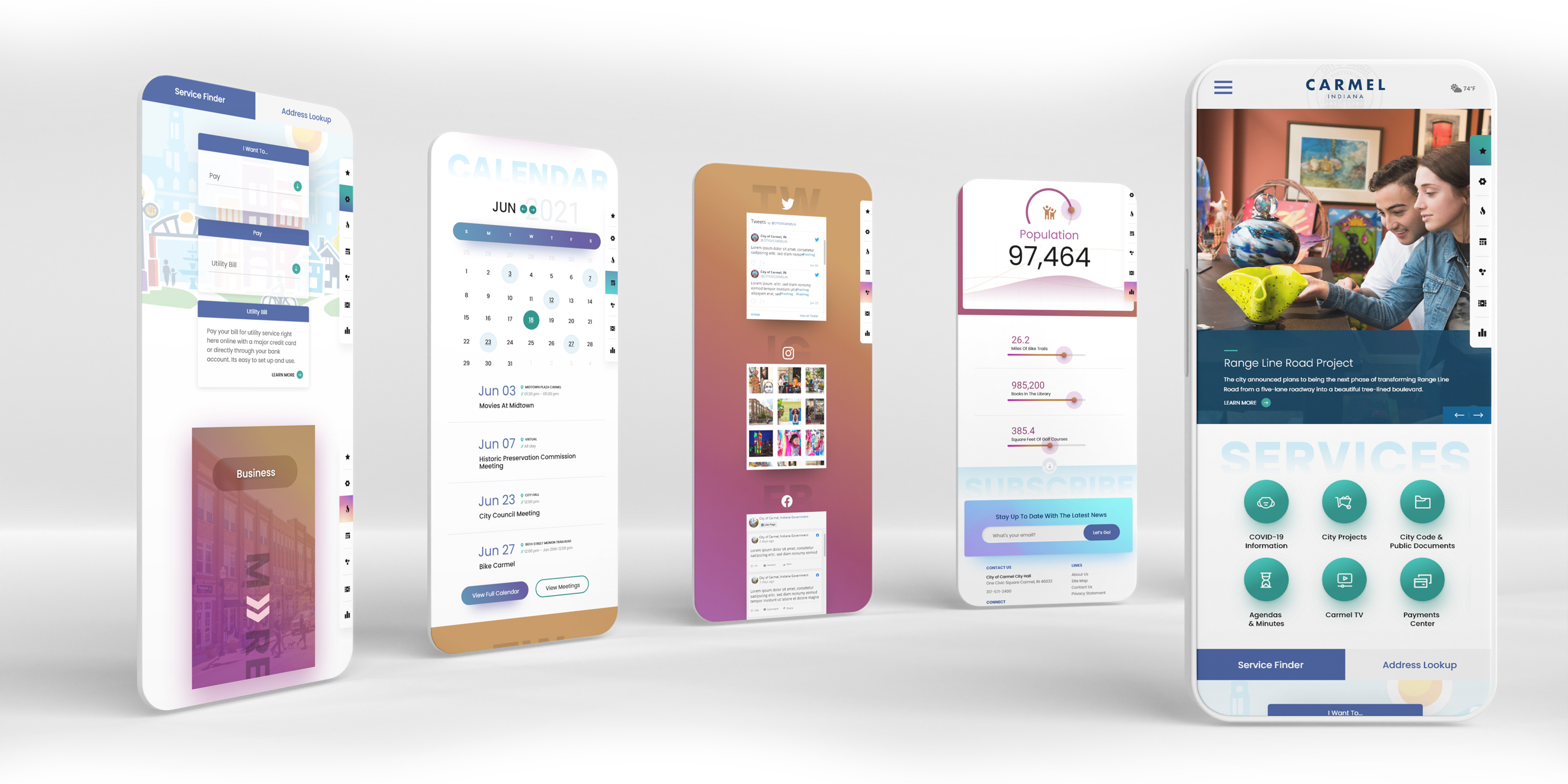
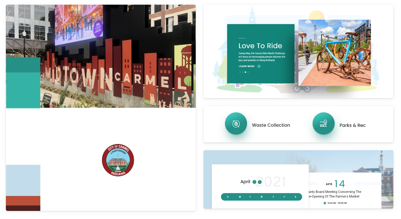
Above The Fold
The client wanted to highlight their imagery and de-emphasize the caption - I anchored the caption to the bottom left and gave its background some transparency so it was noticeable but not emphasized. Since the client liked the 3D buttons from the style tiles I thought a semi-neumorphic style for the search box would be a nice touch.
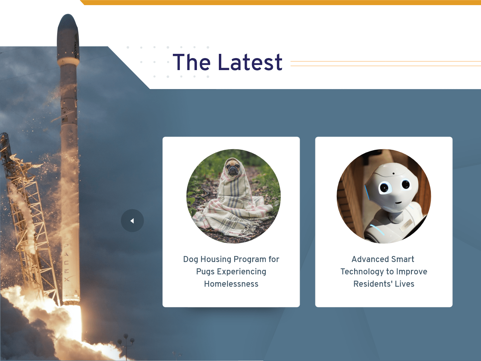
Services
Since the large call-to-action buttons were a success in the style tiles I retained the same style for the initial design. The illustration of the cityscape is a part of the city's branding. I introduce the graphic in full here and then use bits and pieces throughout the rest of the design. This illustration is also the base of this website's color palette.
The Most Requested Links
A user can hover over these cards to reveal links relevant to them as a resident, business, or visitor. Remember, these are the 3 groups that Carmel stated they wanted to target in the redesign.
The Carmel team likes gradients - since their color palette has colors that complement each other well I took the opportunity to mix them into gradients throughout the design. Gradients are a cool way to revitalize a brand's color palette in a redesign.
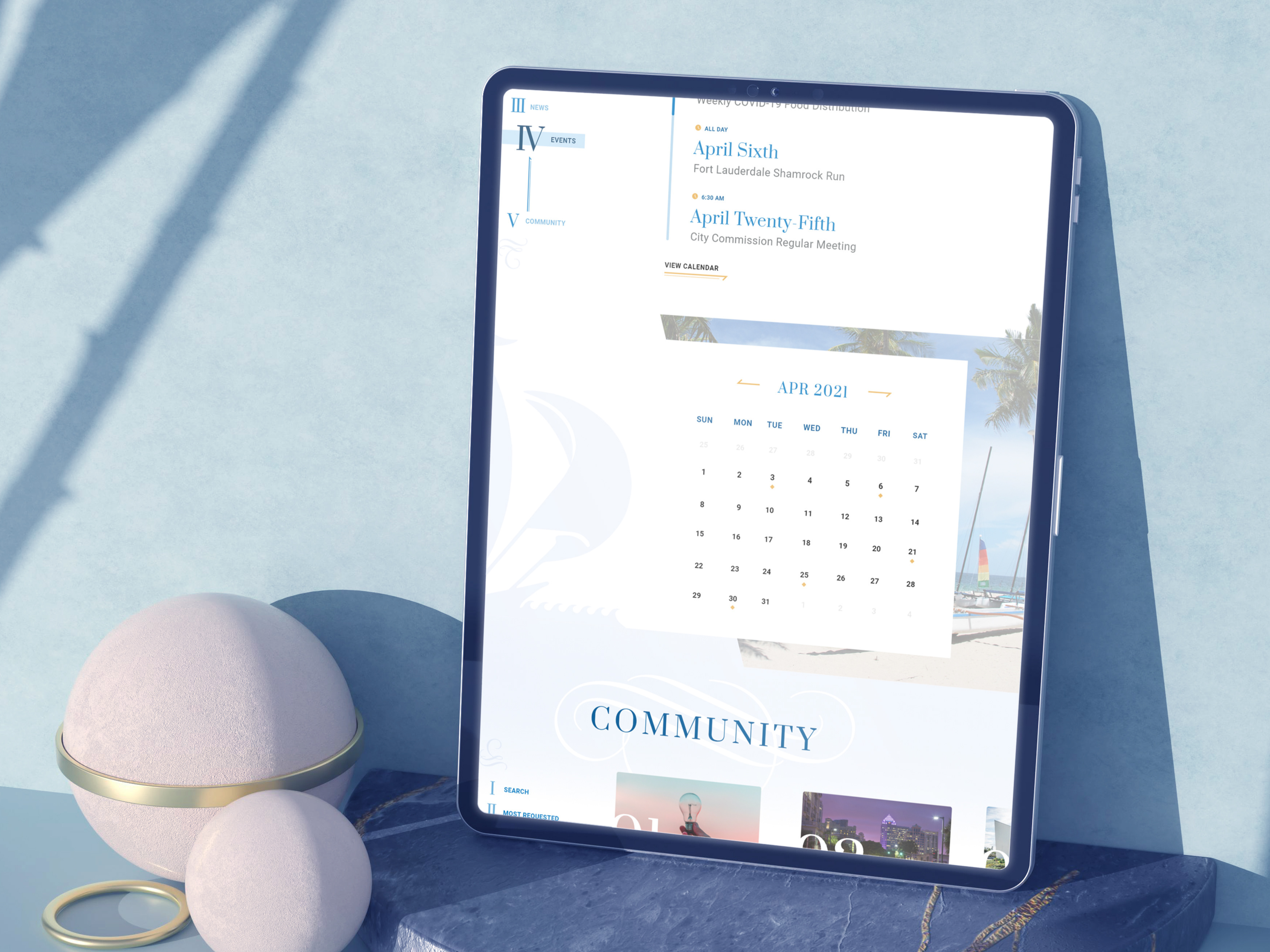
Calendar
The Carmel team wanted a "Free" calendar, meaning one without lines and boxes. Since the calendar dates are flat I added drop shadows to introduce dimension into this section. The drop shadows also help me to bring attention to the "View Full Calendar" call-to-action button.
The graphics on the side are from the illustration in the services section. Aside from the color palette, using pieces of this illustration throughout the design was another way to interject consistent branding throughout the website. Adding them mirrored to the side also adds symmetry to an otherwise asymmetrical section.
Social
The social media live feeds are 3rd party APIs - meaning I don't have any design power over them. To add interest to this section I had to design around the APIs. In the "Most Requested" section I added a gradient overlay over images. I did the same style here, even though the gradient is larger at scale and the background imagery is on either side, the design language is consistent. For the sake of consistency, I did the same style in a later section.
Videos
The Carmel team wanted their public access channel "Carmel TV" to stand out, this is the reason why I made it dominate the section in terms of scale and raised it from the page with the drop shadow. Since there is so much imagery going on here I left the sides completely white. Visual breaks are important for users.
Data Visualization
I brought back the semi-neumorphism to the bottom of the page to be consistent with the 3D look used toward the top. This section acts as a live animation counter, so when the user scrolls to this point the numbers count from zero and the progress bars animate as well.
Don't Forget The Footer
The arrow is a visual cue so that users know they haven't reached the bottom of the page yet. It is also an anchor link, so clicking it pushes the user to the bottom of the footer where they can subscribe and more.
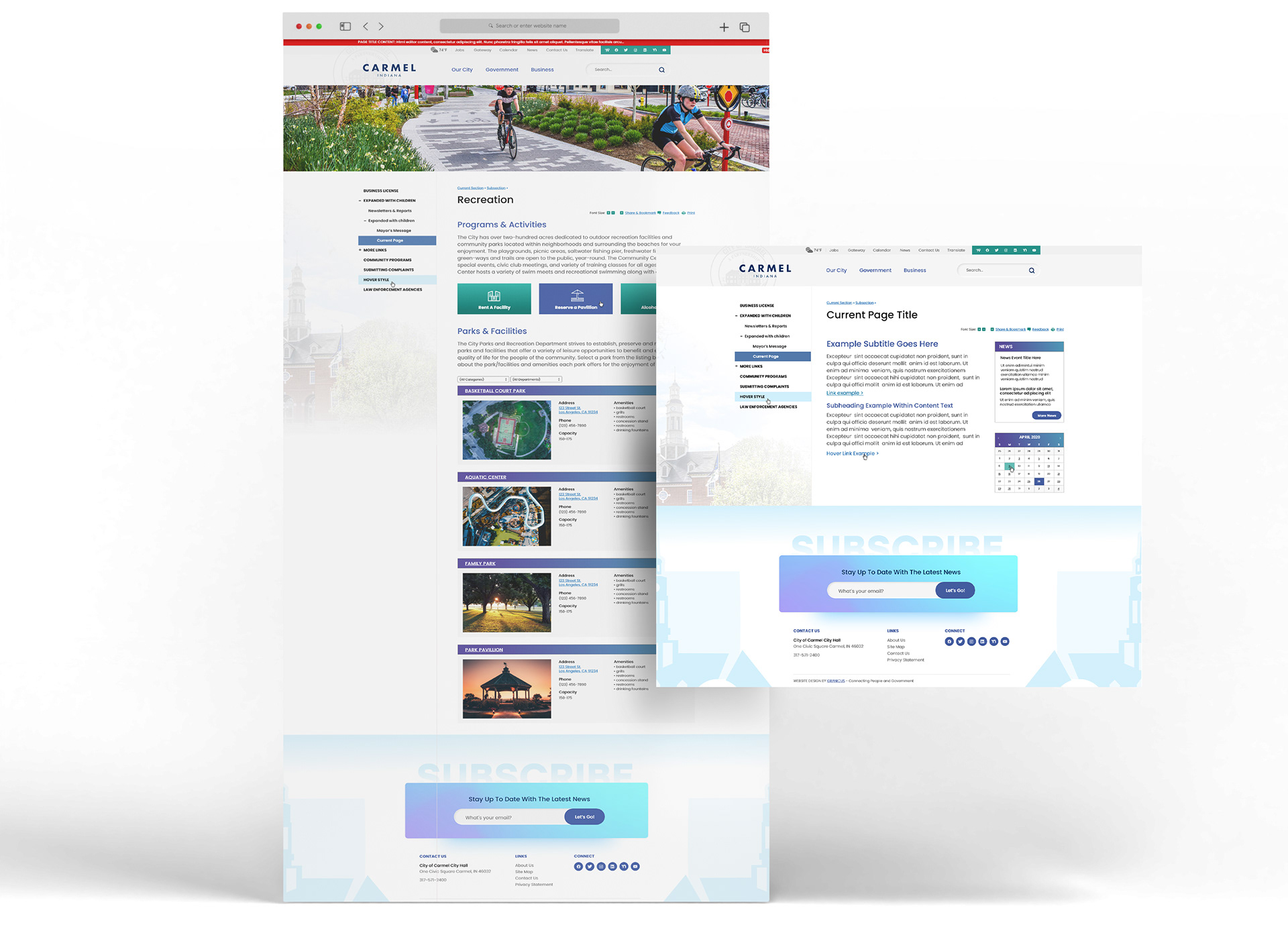
Interior Pages
Responsive Mobile